Film festival logos do more than identify an event - they convey heritage, prestige, and spark instant recognition across print and digital channels. A well-crafted logo balances typography, iconography, and color to evoke a festival’s identity while remaining scalable from billboards to mobile screens. We’ll show why these logos succeed in conveying narrative and prestige at a glance.
This listicle dissects eight pivotal film festival logos, including Cannes, Berlin, Venice, SXSW, Sundance, TIFF, Tribeca, and Busan. For each example, we deliver a concise strategic analysis, highlight behind-the-scenes design methods, and extract actionable takeaways that you can apply immediately. We focus on design takeaways, usage notes, and API sourcing strategies.
Whether you are a SaaS product manager setting up personalized onboarding, a frontend or backend developer integrating brand assets via API, a fintech platform enriching invoices, an AI/LLM team generating branded content, or a stock market app enhancing ticker profiles, this guide provides replicable tactics to streamline logo implementation and maintain brand consistency. By the end, you’ll have a toolkit to integrate film festival logos seamlessly into any digital experience.
What You Will Learn
- Design insights: typography choices, iconic symbols, color psychology, scalability guidelines
- Digital best practices: responsive size presets, clearspace rules, alt text standards
- Integration tips: programmatic logo updates via API/SDK, version control, caching strategies
- AI asset generation: prompt structures, style transfer tactics, dynamic theme matching
Why It Matters
- Elevate brand recall and trust across customer touchpoints
- Ensure visual consistency in onboarding UIs, billing pages, and marketing screens
- Simplify asset management for product and growth teams
- Empower generative AI systems with accurate, on-brand logos
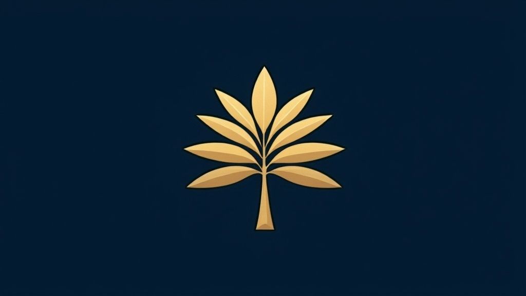
1. Cannes Film Festival Logo - The Palme d'Or
The Cannes Film Festival logo features the iconic golden palm tree known as the Palme d'Or. This symbol has represented cinematic excellence since 1955 and anchors marketing assets with a sense of prestige and Mediterranean glamour.
Design Analysis
The Palme d’Or is constructed from a stylized palm frond in a rich gold hue. Its minimal line weight and geometric curves create immediate recognition across print and digital channels. Key aspects include:
- Typography: Uses a clean, modern serif to complement the icon without competing for attention.
- Iconography: The palm frond silhouette captures both local (Mediterranean) and aspirational (award-winning) associations.
- Color System: Solid gold on dark or white backgrounds for maximum contrast and perceived value.
- Scalability: Maintains clarity at 32 px on event websites and scales seamlessly to 10 ft banners.
“The Palme d’Or exemplifies how a single, well-crafted symbol can carry decades of prestige and drive recognition in any context.”
Actionable Takeaways
- Source a high-quality vector (SVG or AI) to avoid pixelation in responsive designs.
- Define a consistent gold palette in your brand guide (HEX, RGB, CMYK) and lock it across the style system.
- Apply ample clearspace equal to the frond’s width on all sides.
- Pair with a neutral serif typeface when you need supporting headlines or certificates.
- Leverage the prestige messaging, place the icon close to award or highlight sections.
Learn more about what makes a logo good.
Practical API Integration
For SaaS or AI platforms, integrate the Palme d’Or via a logo API and follow these guidelines:
- Define responsive size tokens (e.g., small: 48 px, medium: 120 px, large: 240 px).
- Include alt text: “Cannes Film Festival Palme d’Or logo in gold.”
- Maintain white space by enforcing clearspace rules in CSS or layout components.
- Use API-driven endpoints to fetch the latest logo version, ensuring any brand updates propagate automatically.
When and Why to Use
Use this logo whenever you highlight award-winning films, festival partnerships, or any premium content. Its long-standing heritage drives trust and elevates on-brand storytelling across digital products and print collateral.
2. Berlin International Film Festival - The Golden and Silver Bears
The Berlin Film Festival logo incorporates stylized golden and silver bear silhouettes to symbolize the festival’s highest honors, the Golden and Silver Bears. This visual motif pays homage to Berlin’s coat of arms and local heritage while establishing an intuitive award hierarchy. The dual‐bear design anchors Berlinale’s identity across digital channels and print materials with unmistakable city resonance.
Design Analysis
- Typography: Uses a bold, geometric sans‐serif reminiscent of mid‐century German modernism. The tight letter spacing balances the dynamic bear icons without overpowering them.
- Iconography: Two minimalist bear silhouettes, one in metallic gold, one in silver, denote first and runner‐up awards. Their simplified forms ensure clarity at small sizes.
- Color System: Relies on Pantone 872 C for gold and Pantone 877 C for silver. On dark or white fields these metallic hues pop, reinforcing premium positioning.
- Scalability: Flat, monoline contours preserve the bears’ integrity from 24 px favicons up to 20 ft stage backdrops. The icons remain legible in digital thumbnails and large‐format prints.
“The Golden and Silver Bears combine heritage symbolism with award hierarchy to anchor Berlinale’s identity in both local culture and global cinema.”
Actionable Takeaways
- Source SVG vectors of both bear icons to guarantee crisp rendering at any resolution.
- Define exact metallic swatches (HEX, RGB, CMYK) in your brand guide and lock them in your design system.
- Maintain clearspace equal to the bear height around all logo uses to protect visual integrity.
- Leverage the two‐tone system: gold for premier materials, silver for secondary collateral.
- Subtly embed bear silhouettes in event badges, backgrounds, or overlays for cohesive brand touchpoints.
Learn more about the Berlin International Film Festival on Berlinale's official site.
Practical API Integration
- Offer preset size tokens (small: 48 px, medium: 120 px, large: 300 px) for responsive layouts.
- Include alt text: “Berlinale Golden and Silver Bears logo.”
- Enforce clearspace via CSS custom properties (
--logo-clearspace). - Use a logo API endpoint to fetch updates automatically when festival branding evolves.
When and Why to Use
Deploy this logo for all Berlinale partnerships, award announcements, or themed campaigns. Its iconic bears instantly communicate prestige and local character, boosting recognition and trust across web apps, mobile interfaces, and printed collateral.
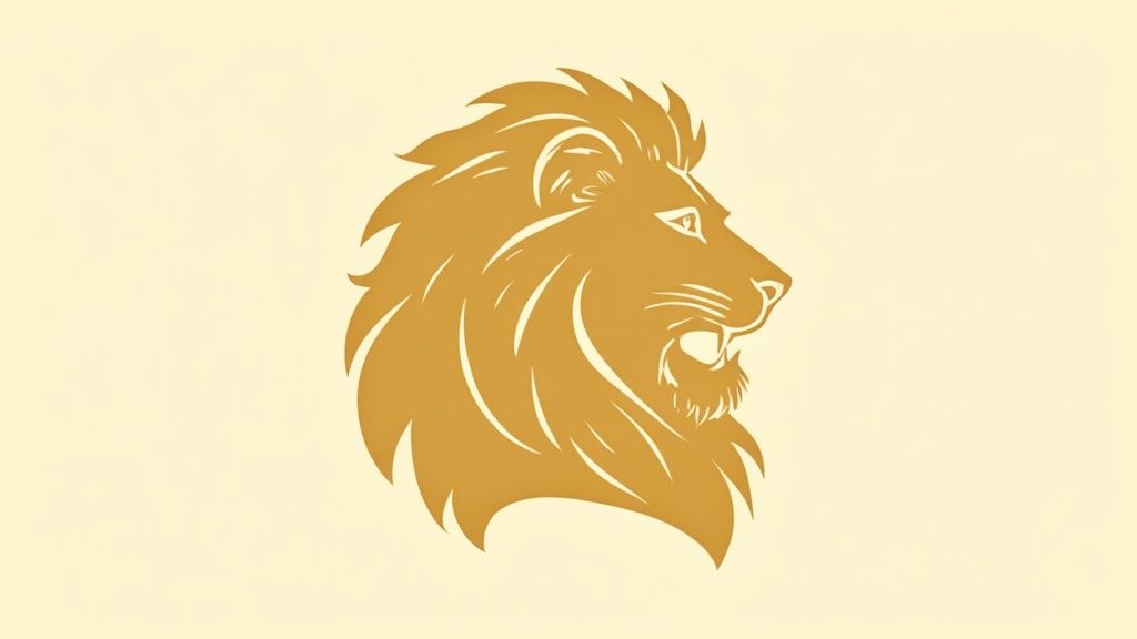
3. Venice Film Festival - The Golden Lion
The Venice Film Festival logo showcases the Golden Lion (Leone d’Oro), a Venetian emblem of ancient power and cinematic prestige. Established in 1932, this icon evokes the city’s rich cultural heritage and stands among the most recognized film festival logos in the world.
Design Analysis
The Golden Lion blends intricate detail with a timeless silhouette to deliver instant recognition across print and digital media. Key elements include:
- Typography: Paired with a refined serif font that echoes Venetian inscriptions, it balances tradition with modern legibility.
- Iconography: The lion’s profile, with flowing mane and stern gaze, communicates authority and artistic excellence.
- Color System: Rich metallic gold on dark blue or black fields reinforces luxury and high contrast for clarity.
- Scalability: Detailed linework holds in large banners and backdrops, while simplified lion head marks work at 48px for avatars or app icons.
“The Golden Lion proves that merging local heritage with premium design elevates a festival’s visual identity across generations.”
Actionable Takeaways
- Source an editable vector (AI or SVG) to preserve the lion’s fine details at any scale.
- Define a consistent gold gradient or flat tone in your style guide (HEX #C89F65, RGB, CMYK).
- Create a secondary simplified mark, lion head only, for small UI placements.
- Enforce clearspace equal to half the lion’s height on all sides in layouts.
- Pair with Venetian architectural textures, columns, arches, in collateral for contextual storytelling.
Practical API Integration
- Establish size tokens (small: 48px, medium: 120px, large: 300px) for responsive design.
- Include alt text: “Venice Film Festival Golden Lion logo in metallic gold.”
- Automate clearspace rules in CSS or layout components via a logo API configuration.
- Fetch updates from a logo endpoint to ensure any festival branding revisions are live in your app.
When and Why to Use
Use the Golden Lion logo when promoting Venice Film Festival partnerships, award ceremonies, or cultural content. Its heritage-infused icon drives trust among cinephiles and partners, reinforcing prestige in web apps, mobile experiences, and printed materials alike.
4. SXSW Film Festival - Modern Geometric Abstraction
The SXSW Film Festival logo employs a modern, minimalist abstraction of overlapping geometric forms. Bold lines and dynamic angles reflect the festival's emphasis on innovation and cross-disciplinary creativity. Vibrant color palettes appeal to younger audiences and independent filmmakers, while the abstract composition allows for versatile applications, from animated web headers to social media badges.
Design Analysis
The SXSW look is built on a foundation of precise geometry and vivid color. Key aspects include:
- Typography: A custom geometric sans-serif balances the icon’s sharp angles with uniform stroke widths.
- Iconography: Abstracted triangles and parallelograms hint at film clapper shapes and play buttons without literal depiction.
- Color System: High-contrast palettes (neon green, magenta, cyan) ensure legibility on digital timetables and festival passes.
- Scalability: Vector shapes translate seamlessly from mobile (32 px) to giant projection screens (15 ft) and support CSS keyframe animation.
“The SXSW logo leverages geometry and color to mirror the festival’s ethos of innovation and cross-disciplinary creativity.”
Actionable Takeaways
- Develop animated versions using CSS or SVG keyframes to rotate or shift shapes.
- Build a modular shape library for quick creation of category or sponsor icons.
- Standardize bold color combinations in your design system to stand out on crowded schedules.
- Enforce consistent angles (for example 15° increments) to maintain brand coherence.
- Apply clearspace equal to one shape’s width on all sides for visual balance.
Learn more about the SXSW Film Festival - Modern Geometric Abstraction on sxsw.com: sxsw.com/film
Practical API Integration
- Define responsive size tokens (small: 48 px, medium: 120 px, large: 240 px).
- Include alt text: “SXSW Film Festival modern geometric abstraction logo.”
- Enforce clearspace in CSS or layout frameworks based on the geometric bounding box.
- Use a logo API endpoint to fetch the latest vector files and color values automatically.
When and Why to Use
Use this logo approach when promoting tech-driven panels, music and film collaborations, or social campaigns targeting creative professionals. Its bold geometry and vivid palette immediately signal a forward-thinking brand, ensuring consistency across digital ads, streaming platforms, and interactive installations. By embracing modular abstraction, your product can adapt SXSW’s style to diverse touchpoints without losing the festival’s spirit of innovation.
5. Sundance Film Festival - Organic, Abstract Expressionism
The Sundance Film Festival logo features organic, flowing forms with warm earth tones, reflecting the festival’s commitment to independent and artist-driven cinema. Established by Robert Redford, the abstract expressionistic design conveys creativity, passion, and authenticity. The irregular shapes and hand-drawn quality symbolize Sundance’s support for unconventional storytelling and emerging voices.
Design Analysis
- Typography: Custom hand-lettered wordmark uses uneven strokes and subtly varied letter heights, reinforcing the human touch.
- Iconography: Abstract brushstroke motifs evoke mountain landscapes and creative spontaneity.
- Color System: A palette of terracotta, olive green, and muted ochre creates warmth and grounding across print and digital.
- Scalability: Hand-drawn details are vectorized into simplified outlines for clarity at small sizes while preserving texture in large-scale banners.
“The hand-crafted aesthetic underlines Sundance’s ethos of authenticity and artist-first storytelling.”
Actionable Takeaways
- Source a high-quality vector (SVG or AI) that preserves brushstroke textures.
- Define your earth tone palette (HEX, RGB, CMYK) and include light/dark variations.
- Apply clearspace equal to the widest stroke around the logomark in all layouts.
- Pair with authentic, artist-focused messaging in headers and collateral.
- Integrate organic shapes into UIs as background patterns or separators.
Learn more about what makes a logo good.
Practical API Integration
- Define responsive size tokens (small: 64 px, medium: 150 px, large: 300 px).
- Include alt text: “Sundance Film Festival hand-drawn logo in earth tones.”
- Enforce clearspace rules via CSS variables or design tokens.
- Expose endpoints to fetch the latest vector asset, ensuring brand updates sync across platforms.
When and Why to Use
Use this logo when you want to highlight independent or documentary film showcases, filmmaker guides, and festival catalog covers. Its handcrafted vibe drives authenticity in event websites, mobile apps, and print programs. Pairing the logo with artist resources or film selection announcements amplifies Sundance’s legacy of championing diverse voices and unconventional narratives.
6. TIFF (Toronto International Film Festival) - Bold Typographic Identity
The TIFF logo centers on a custom, bold wordmark that prioritizes clarity and modernity. Its simple yet powerful typography anchors all festival assets, from print catalogs to streaming banners, making it one of the most versatile film festival logos in use today.
Design Analysis
- Typography: Custom sans serif with heavy weight and tight kerning for instant legibility.
- Wordmark Geometry: Blocky letterforms maintain visual cohesion across scales, from mobile interfaces to billboard posters.
- Color System: Solid black or white treatments on contrasting backgrounds underscore readability in any context.
- Whitespace Guidelines: Generous clearspace around the letters creates breathing room in layouts.
- Brand Consistency: A single font family applied across programs, signage, and digital assets unifies festival messaging.
“TIFF’s typographic identity proves that a stripped-back wordmark can deliver maximum impact when every letter is treated as a design element.”
Actionable Takeaways
- Develop a comprehensive typography system with defined weights, sizes, and spacing tokens.
- Create clear whitespace guidelines equal to the height of the “T” on all sides.
- Use consistent font families across web, print, and video titling.
- Maintain bold weight for headlines and logos to ensure stand-out presence.
- Pair typography with minimalist backgrounds and accents for high contrast.
- For insights on selecting effective font choices for signs, evaluate character shapes that maximize readability.
Learn more about TIFF's official website.
Practical API Integration
- Define responsive size tokens (e.g., xs: 24 px, sm: 48 px, md: 120 px, lg: 240 px).
- Include alt text: “TIFF bold typographic logo in black.”
- Enforce clearspace rules via CSS variables or layout components.
- Use a logo endpoint to fetch the latest SVG, ensuring brand updates propagate automatically.
- Store font files in a central asset service to apply consistent typography across your product UI.
When and Why to Use
Use TIFF’s bold typographic logo whenever you need a modern, no-nonsense identifier that scales from mobile apps to physical signage. Its simplicity drives strong brand recall, making it ideal for digital platforms, promotional campaigns, and partner integrations.
7. Tribeca Film Festival – Geometric City Abstraction
The Tribeca Film Festival logo abstracts the neighborhood’s iconic grid pattern and urban landscape into bold geometric shapes. This modern interpretation reflects the festival’s deep roots in New York City and its community spirit, making the mark instantly recognizable on street signage and digital platforms alike.
Design Analysis
- Typography: Uses a sturdy, condensed sans serif that echoes the precision of city architecture without competing for visual attention.
- Iconography: The logo distills Tribeca’s block grid and skyline edge into interlocking squares and rectangles. This abstraction simultaneously suggests streets, buildings, and frames of film.
- Color System: A limited palette of black, white, and a vibrant red accent amplifies contrast on posters and merchandise. The red block nods to subway tokens and marquee lights.
- Scalability: The geometric forms hold crisp detail at 24 px on mobile apps and scale seamlessly to 30 ft outdoor banners.
“By distilling the urban grid into a simple mark we ground the festival in place while maintaining a modern, cinematic presence.”
Actionable Takeaways
- Leverage the geographic backstory in storytelling, feature neighborhood maps or event guides that highlight Tribeca landmarks.
- Maintain geometric precision: use exact grid measurements in design templates to preserve brand consistency.
- Use ample clearspace equal to one block’s width around the icon on all print and digital assets.
- Develop supporting iconography (wayfinding arrows, event badges) using the same square-and-rectangle language.
- Tie in local partnerships by co-branding with community organizations using the red accent for emphasis.
Learn more about the Tribeca Film Festival logo on the official site: tribecafilm.com
Practical API Integration
- Define responsive size tokens (small: 32 px, medium: 96 px, large: 256 px).
- Include alt text: “Tribeca Film Festival logo with red and black geometric blocks.”
- Enforce CSS clearspace rules by embedding layout constraints in your design system.
- Use a logo API endpoint to pull the latest vector asset, ensuring updates (color or layout tweaks) propagate instantly.
When and Why to Use
Use this logo when you want to emphasize urban authenticity and community ties, ideal for local event promotions, neighborhood screenings, and sponsor banners. Its minimalist geometry delivers a fresh, place-based identity that resonates with both in-person attendees and online audiences.
8. Busan International Film Festival - Asian Contemporary Design
The Busan International Film Festival logo blends traditional Asian aesthetics with contemporary design sensibilities. The flowing curves and symbolic imagery draw on Korea’s cultural heritage, while the modern color palette ensures global appeal. This balanced approach positions the festival as a bridge between Eastern and Western cinema, making it one of the most memorable film festival logos in Asia.
Design Analysis
- Typography: A custom sans serif with soft terminals complements the fluid iconography without overpowering it.
- Iconography: Wave-like forms reference both ocean currents off Busan’s coast and brush strokes in East Asian calligraphy.
- Color System: Rich indigo and deep crimson pay homage to traditional Korean textiles, contrasted with neutral grays for flexibility.
- Scalability: The simplified curves remain legible at 24 px on mobile apps, yet scale cleanly to large outdoor banners.
“The Busan logo shows how subtle cultural cues can create a global brand identity that resonates across borders.”
Actionable Takeaways
- Research and respect cultural symbolism before integrating local motifs.
- Create detailed brand guidelines that specify color usage in HEX, RGB, and CMYK.
- Use color psychology aligned with regional meanings to evoke desired emotions.
- Pair traditional elements with modern shapes for a contemporary heritage feel.
- Develop multilingual lockups to support festival signage and promotional assets.
Learn more about the Busan International Film Festival.
Practical API Integration
- Define responsive size tokens (small: 32 px, medium: 96 px, large: 200 px) in your design system.
- Include alt text: “Busan International Film Festival logo with Asian contemporary design.”
- Enforce clearspace rules equal to 50% of the icon height in CSS or layout frameworks.
- Use API endpoints to fetch the latest logo asset, ensuring festival rebrands propagate automatically.
- Store version metadata (year, color mode) to track updates and regional variations.
When and Why to Use
Use this logo whenever you need to highlight East Asian cinema showcases, cross-cultural film panels, or partnerships with Busan IFF. Its cultural authenticity drives engagement among audiences seeking both heritage and innovation. As one of the leading film festival logos, it elevates digital products, print materials, and event branding with a clear nod to Korea’s rich artistic legacy.
Top 8 Film Festival Logo Comparison
| Logo / Visual Style | Implementation Complexity | Resource Requirements | Expected Outcomes | Ideal Use Cases | Key Advantages |
|---|---|---|---|---|---|
| Cannes Film Festival, Palme d'Or (golden palm) | High, detailed metallic rendering and strict brand controls | High, vector masters, color management, licensing | Strong global prestige and instant recognition | Award trophies, premium marketing, editorial covers | Extremely memorable; conveys prestige and heritage |
| Berlin International Film Festival, Golden & Silver Bears | Medium–High, stylized animal forms with color hierarchy | Medium, multiple color variants, careful illustration | Strong local identity and clear award distinctions | Festival posters, ceremony backdrops, local promotion | Cultural relevance; memorable mascot and award clarity |
| Venice Film Festival, Golden Lion (heraldic lion) | High, intricate linework and rich gold tones | High, detailed artwork, simplified marks for small sizes | Historical authority and refined prestige | Formal invitations, press kits, heritage branding | Deep historical significance; unique among peers |
| SXSW, Modern Geometric Abstraction | Low–Medium, modular geometric system, easy to adapt | Medium, digital assets, motion/animation resources | Youthful, contemporary presence with high digital impact | Social media, digital campaigns, cross-industry events | Highly versatile, scalable, and animation-friendly |
| Sundance, Organic Abstract Expressionism | Medium, maintain hand-drawn/organic feel consistently | Medium, skilled illustrators, strict reproduction guides | Authentic, artist-focused emotional resonance | Indie programming, artist resources, festival catalogs | Strong authenticity; resonates with independent creators |
| TIFF, Bold Typographic Identity | Low, typographic system rather than complex illustration | Medium, custom typeface work and typography system docs | Clear, highly legible identity across all media | Program guides, signage, streaming platforms | Exceptional readability and broad adaptability |
| Tribeca, Geometric City Abstraction | Medium, precise geometric execution tied to place | Medium, design system and storytelling materials | Memorable symbol tying festival to neighborhood identity | Local signage, community marketing, city campaigns | Strong geographic narrative and local memorability |
| Busan International Film Festival, Asian Contemporary Design | High, fusion of traditional motifs and modern execution | High, cultural research, color management, guidelines | Cultural authenticity and distinctive international positioning | Opening ceremonies, cultural exchange, international promotion | Bridges Eastern and Western aesthetics; culturally resonant |
Next Steps for Your Logo Journey
Now that you have explored the design strategies behind eight iconic film festival logos, it is time to put these lessons into action. This section recaps the critical insights, offers tactical takeaways, and outlines clear next steps for integrating film festival logos into your own projects.
Key Insights Recap
- Typography as Voice
Cannes and TIFF show how a custom type treatment can anchor your logo’s personality. - Iconography with Purpose
Berlin’s bears and Venice’s lion use simple shapes to convey heritage and prestige. - Color Consistency
SXSW’s geometric palette and Busan’s contemporary hues prove that color drives recognition. - Scalability First
Sundance’s organic marks and Tribeca’s city grid remain legible from billboard to favicon. - Responsive Design
Every logo example includes mobile, tablet, and desktop variations for seamless UI integration. - API-Driven Updates
Automating logo sourcing prevents outdated assets in your digital products.
“Design your logo as a living asset that adapts across screens, platforms, and contexts.”
Actionable Takeaways
- Establish a color system with primary, secondary, and accent swatches for brand unity.
- Choose a type hierarchy that balances legibility and style at multiple sizes.
- Create a modular icon that can lock up with text or stand alone.
- Define clearspace rules and minimum size thresholds to preserve impact.
- Write descriptive alt text for every variant to boost accessibility and SEO.
Practical Steps for Integration
- Audit your current logo files in Figma or Sketch and standardize export settings.
- Set up a dedicated logo endpoint using a service like Brand.dev for consistent asset delivery.
- Test each logo variation in your product’s responsive breakpoints and record any legibility issues.
- As you envision dynamic media or video intros, consider how to animate your logo to create a lasting impression.
- Embed logo metadata, hex codes, typography names, usage rules, into your design system's JSON or YAML files.
Why Mastering Film Festival Logo Principles Matters
Applying proven strategies from Cannes, Berlin, Venice, and beyond ensures your brand:
- Stands out in crowded markets
- Communicates values at a glance
- Adapts to new platforms without redesign
- Scales gracefully as your organization evolves
By mastering these concepts, typography, iconography, color theory, and automation, you lay the groundwork for a logo that endures and elevates every user touchpoint.
Your festival or product deserves a logo as memorable as the films it represents. Take these next steps with confidence and watch your brand identity come to life in both static and dynamic media.
Ready to automate your logo workflows and serve on-brand assets at scale? Explore Brand.dev and integrate real-time logo APIs and style guides directly into your design and development process. Start your free trial at Brand.dev and elevate how you manage film festival logos across every touchpoint.