A Brand Style Guide is your team’s playbook for how your company looks, sounds, and feels. It captures logo rules, color swatches, typography settings, imagery direction, and your unique tone of voice. With these guidelines, every email, social post, or web page feels like part of one cohesive story.
Key Benefits Of A Style Guide
When everyone follows the same set of rules, projects move faster. Teams spend less time debating choices and more time creating. The result? Consistency that deepens recognition and builds trust.
At its core, a guide covers:
- Logo sets the foundation by specifying lockups, clear space, and approved versions
- Color Palette taps into emotions with defined hex codes and supporting swatches
- Typography controls readability and tone through font families, sizes, and hierarchy
- Tone Of Voice shapes your messaging, from word choice to sentence structure
- Imagery steers photography, illustrations, and icon use for visual consistency
For deeper insights, explore 35 Must-Know Branding Statistics for Growth & Engagement. This report highlights why a solid style guide boosts engagement and leaves a lasting impression.
Brand Style Guide Quick Summary
| Component | Purpose | Key Elements |
|---|---|---|
| Logo | Recognition and trust | Approved sizes, clear space, variations |
| Color Palette | Emotional impact and cohesion | Hex codes, primary and secondary swatches |
| Typography | Readability and brand voice | Font families, weights, hierarchy |
| Tone Of Voice | Consistent messaging experience | Vocabulary rules, style examples |
| Imagery | Visual storytelling | Photo style, icons, usage guidelines |
This table gives a rapid snapshot of each component before we dive deeper into why they matter and how to apply them in your brand narrative.
Rapid Benefits
-
Faster Workflows
Clear rules mean fewer rounds of feedback and faster delivery. -
Stronger Recall
A unified look and voice stick in people’s minds. -
Cohesive Campaigns
Every touchpoint feels like part of the same conversation.
Keep this overview close at hand. Align every design and copy decision with your style guide to maintain on-brand consistency. Start applying these elements today and watch your brand cohesion, and confidence, soar.
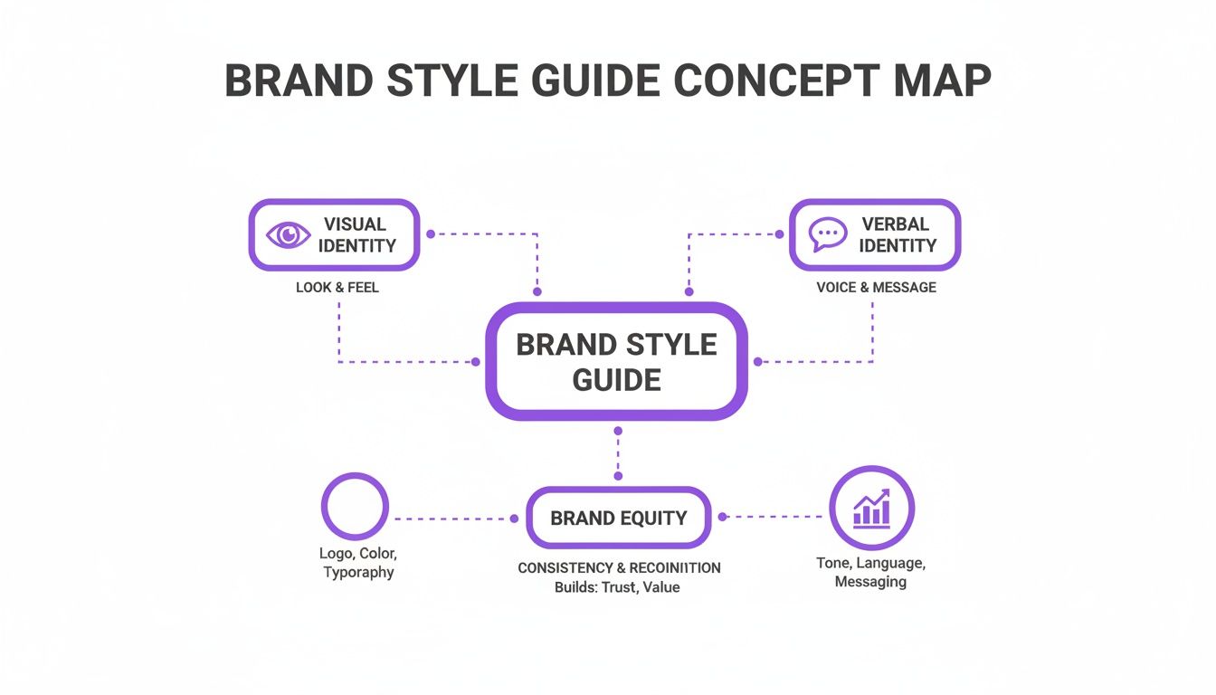
Understanding The Key Concepts
A brand style guide is your recipe book for consistency. It lays out the exact blend of visuals, language, and tone so every touchpoint feels unmistakably yours.
Imagine baking cookies without a recipe: one batch might be buttery perfection, the next a crumbly mess. A guide sets the steps to keep results uniform and trustworthy.
Visual Identity covers your logo’s usage rules, color palette, and imagery direction. Verbal Identity defines tone of voice, messaging style, and approved terminology. Brand Equity tracks how your audience perceives and trusts you over time.
Simple tweaks, like specifying logo size, clear space, or approved color swatches, mean designers never mix up the ingredients. Likewise, a shortlist of phrases and a defined writing style keep copywriters on the same page.
“Consistency builds recognition and deepens trust with audiences.”
Key Terminology Explained
-
Visual Identity
The rules for logo lockups, brand colors, and image style. -
Verbal Identity
Guidelines for tone, vocabulary, and messaging. -
Governance
The process for approving updates and auditing compliance.
Together, these terms form the backbone of any solid brand style guide.
Think of governance as your quality control. Without it, ingredients drift and outcomes vary. Building formal review workflows, sign-offs, and periodic audits keeps your guidelines fresh and enforced.
Importance Of Parameters
Setting clear boundaries avoids off-brand detours. When teams know which fonts, colors, and image styles are allowed, they spend less time guessing, and more time creating.
A style guide serves as a single source of truth across all channels:
- Print collateral follows logo clear-space and color reproduction rules.
- Digital experiences stick to consistent color codes and typographic hierarchies.
- Environmental signage uses layout grids and font scales for wayfinding.
This unified approach cuts revision loops and accelerates time to market.
You might be interested in exploring our detailed look at core branding concepts in our article on branding fundamentals.
Every rule in a style guide is like a cooking tip that prevents a burnt cake. Follow the steps, and you build trust while laying the groundwork for scalable, on-brand experiences.
With these basics, your team gains clarity, speed, and confidence before drafting any guidelines.
An analogy drives this home: think of your style guide as a navigation map across brand territory. It shows where each element belongs and how they connect.
| Element | Role |
|---|---|
| Logo | Identifies brand instantly |
| Color Palette | Evokes emotion consistently |
| Typography | Guides readability and voice |
| Tone Of Voice | Shapes personality in messaging |
| Imagery | Conveys visual storytelling |
Teams adapt this guide for websites, emails, print, social, and office spaces. The result? Every channel feels like part of the same story.
By defining terms upfront and agreeing on parameters, you eliminate confusion and foster alignment, setting the stage for a brand that not only looks cohesive but also resonates deeply.
Exploring Core Components
A brand style guide distills every decision into six core components that keep your identity cohesive across channels. Think of it as a roadmap: when everyone follows the same directions, your brand always arrives at the right destination.
Logo Usage Rules
To start, your logo is the face of your brand. Clear rules around placement and treatment make it instantly recognizable:
- Approved Variations: Full-color and monochrome options
- Clear Space: Minimum padding set in height units
- Don’ts: No stretching, no drop shadows, no skewing
These simple boundaries protect your logo’s integrity no matter where it appears.
Color Palette Specifications
Next up, color isn't just decoration, it's emotion in action. A robust palette section should spell out:
- Primary Colors: Exact hex values like #1A73E8 for your signature blue
- Secondary Swatches: Accent hues such as #F4B400 and #34A853
- Usage Examples: Guidance for text, backgrounds, and UI elements
When you use #1A73E8 on buttons or links, you reinforce brand cohesion and help users know what to click.
Typography Guidelines
Fonts are your silent ambassadors. Defining a clear, fallback-friendly stack ensures readability everywhere:
- Roboto Regular for body text
- Roboto Bold for headings
- Arial sans-serif as a safety net
This trio guarantees a consistent voice in web, print, and mobile contexts.
Tone Of Voice Principles
Words shape perceptions. A voice guide usually covers:
- Core Attributes: Friendly, straightforward, confident
- Sample Phrases: “Submit your application and we’ll handle the rest.”
- Words To Avoid: Industry jargon, negative phrasing
“Consistent tone builds trust and engagement.”
With these guardrails, every writer knows exactly how your brand speaks.
Imagery Direction
Visuals bring your personality to life. Clarify style by outlining:
- Photography Style: Bright, candid shots with minimal filters
- Iconography: Simple line art in brand colors
- Avoid: Overly stylized or clashing imagery
That way, every image feels like it belongs to your story.
Spacing And Layout Rules
Whitespace and grids aren't optional extras, they're the foundation of clarity:
- Margins & Padding: 16px outer margins and consistent inner spacing
- Grid System: Column layouts for responsive designs
- Alignment: Rules for text, images, and components
Stick to these rules and your layouts will appear balanced and professional.
Core Component Comparison
Here’s a quick look at how three sample brands tackle these core elements:
| Component | Brand A Approach | Brand B Approach | Brand C Approach |
|---|---|---|---|
| Logo | Full-color only with 1× clear zone | Monochrome version allowed with rounded area | Horizontal lockup with margin specs |
| Colors | Primary blue (#0058A3) and grey | Multi-tone gradients with accent rules | Single bold hue (#D7263D) for impact |
| Typography | Open Sans regular + bold stack | Georgia serif for headlines, Arial for body | Helvetica Neue across all text |
| Tone | Warm and conversational | Formal and authoritative | Playful and optimistic |
Even with different flavors, each brand achieves consistency by defining clear boundaries.
Usage In Real World
Translating guidelines into actual designs eliminates guesswork:
- Email headers with the logo in the top-left corner and 20px clear space
- Buttons using primary blue by default and brand green on hover
- Social posts following the photo style with matching color overlays
Tip: Updating your guide every six months reflects brand evolution.
When your team sees real examples alongside rules, applying the style guide becomes second nature.
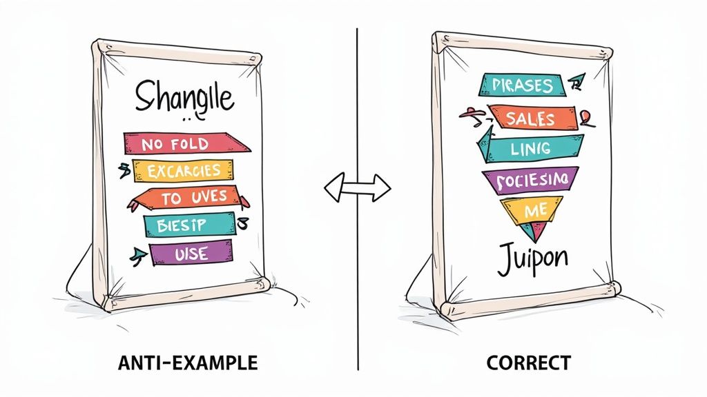
Real World Examples and Anti Examples
Nothing beats seeing a brand guide in motion. By walking through success stories and cautionary tales, you pick up tips on how consistency solidifies trust.
Nike Brand Example
When you think of Nike, that swoosh is everywhere, from billboards to your running shoes. Their manual demands a 1× clear space around the logo and specifies #111 black for all text. This simple rule ensures the brand never loses its edge against vibrant backgrounds.
"The swoosh must never get too cozy with other elements."
How Nike protects its icon
Key elements include:
- Approved logo lockups on product photography
- A precise palette of 2 primary shades: black and white
- A voice that stays bold and motivational
Before-and-after visuals spotlight the impact. Proper treatments show the swoosh centered and uncluttered. Mistakes pop up when it’s tucked into corners or laid over busy patterns.
- Maintain proper spacing around the logo
- Stick to Futura Condensed Medium for headlines
- Use on-brand messaging like “Just Do It” only in vetted layouts
This level of rigor yields 80% brand recall in global surveys.
Anti Example Spotlight
On the flip side, consider a startup that skipped the rulebook. They swapped out their bright blue for a muddy green and unleashed Comic Sans in headlines. Suddenly, their campaigns felt scattered and unprofessional.
A table summarizes the missteps:
| Mistake | Impact |
|---|---|
| Wrong hex (#6B8E23) | Weak emotional response |
| Comic Sans headlines | Perceived as unprofessional |
| No clear space rules | Logo overlaps with photos |
Inconsistent branding erodes credibility.
This cautionary tale shows exactly why a style guide isn't optional, it's your brand's north star.
Starbucks Brand Example
Starbucks treats its siren like a modern-day emblem. Their playbook lays out a 42px minimum logo size for digital, demands only Pantone 342 forest green, and pushes a warm, candid photography style.
Implementing these rules across store signage, apps, and packaging creates a cohesive feel. In fact, social media posts from baristas who follow the guide see 25% more engagement.
Benefits include:
- A unified visual impact in stores around the world
- Faster approvals for social campaigns
- A clear, consistent voice in customer emails and app notifications
Learning From Examples
These stories offer a clear lesson: consistency matters.
- Follow logo clear space guidelines
- Use only approved color codes
- Keep typography uniform
Teams that embrace a style guide dodge common pitfalls like off-brand logos and mixed messages. The payoff? Cohesive marketing, stronger recognition, and fewer revision cycles.
Next up: a hands-on checklist to build your own guide. Armed with these insights, you’ll avoid the confusion of the anti example and tap into the power of best-in-class brand consistency.
Consistency wins every time. Keep it tight, and always stick to your rules.
Business Value And Governance
A brand style guide isn’t just a collection of rules. It’s the engine that powers efficient marketing workflows and shapes how people perceive your company.
When teams know exactly what's expected, guesswork, and those endless revision cycles, vanish. As a result, campaigns hit their marks on time instead of scrambling at the last minute.
Consistent guidelines can slash launch times by up to 20%, freeing designers and marketers to focus on strategy rather than tweaks. And the benefits reach far beyond speed.
- 10–20% revenue growth for companies that stick to uniform branding
- Up to 30% reduction in design costs thanks to clearer feedback loops
- 23% lift in consumer trust when visuals and messaging align across channels
These figures turn into tangible bottom-line gains in just a few months. Investing time in a thorough style guide pays off exponentially as your brand assets multiply.
Key ROI Metrics
Think of brand consistency as a series of friendly nudges that reinforce who you are. Every color code, font choice, and logo placement builds familiarity and trust.
When everyone, from product managers to developers, speaks the same visual language, the business sees 10–20% revenue growth and a 23% boost in audience trust.
Learn more about branding stats findings at Wiser Notify.
“Aligning brand usage guidelines reduces confusion and fuels measurable growth,” says design strategist Maria Chen.
By tracking these ROI metrics regularly, you can demonstrate the guide’s impact and secure further branding investments.
Governance Models
Drafting a guide is only half the battle. Governance turns guidelines into living standards that every team follows.
- Review Board meets monthly to approve major brand updates
- Workflow Automation routes new assets directly to the right approvers
- Audit Schedule checks for compliance and outdated specs each quarter
- Escalation Paths clarify who makes urgent or conflicting decisions
Version control logs every edit, making rollbacks painless when needed. This transparent process builds confidence and keeps everyone in sync.
Best Practices For Enforcement
A guide without proactive enforcement quickly becomes a suggestion. Start by appointing a brand manager to answer questions and drive updates.
Empower brand champions in each department to monitor daily usage and catch deviations early. Then:
- Schedule quarterly audits to spot misalignments before they snowball
- Track compliance metrics, review rates, error counts, turnaround times
- Share ROI wins (like design cost savings) in leadership updates
- Use dashboards and calendar reminders to keep the guide top of mind
Regular training sessions and quick check-ins ensure everyone knows the latest specs. And by showcasing real-world wins, you turn brand governance into a competitive advantage.
To explore continuous brand alignment, read our guide on brand consistency.
Consistency pays dividends.
Creating Your Brand Style Guide Checklist
Building a brand style guide feels a lot like plotting a road trip. You need a clear route, checkpoints, and shared tools so everyone arrives at the destination together.
First, gather your essentials to prevent detours:
- Outline clear objectives for what the guide must achieve
- Identify stakeholders in design, marketing, and development
- Plan timelines and deliverables to keep the project on schedule
Initial Research And Interviews
Start by surveying the terrain. Collect existing brand assets, review competitor materials, and pinpoint gaps in your current guidelines.
Then, sit down with your core team. Chat with marketing leads, designers, and product owners about tone, visuals, and past frustrations. Getting on the same page here slashes surprises later.
- Gather brand artifacts: logos, color swatches, icon sets
- Schedule 30-minute interviews with each key stakeholder
- Log insights in a shared collaboration tool
Draft Core Components
Armed with fresh insights, map out the heart of your guide:
- Logo rules: clear space, color vs. monochrome, dos and don’ts
- Color palette: primary, secondary, and accent swatches with codes
- Typography: font families, sizes, and hierarchy
Next, define your voice. Provide phrase examples, flag forbidden words, and sketch out imagery guidelines for photos, icons, or illustrations.
Finally, detail file formats, naming conventions, and storage paths. When you nail these specs, your guide shifts from static doc to living toolkit.
| Component | File Formats | Notes |
|---|---|---|
| Logo | SVG, EPS, PNG | Include color and mono versions |
| Color Palette | ASE, CSV | List hex, RGB, and Pantone codes |
| Typography | TTF, OTF, WOFF | Provide licensed font files |
Detailed documentation reduces support queries by 40%.
Conduct Reviews And Secure Approvals
With a first draft ready, open it up for feedback. Use version control so you can see who said what in real time.
Aim for two review cycles. Refine language, fill in missing assets, and align on budget needs. Then lock in sign-off from leadership or your governance board. Setting deadlines here avoids endless back-and-forth.
- Share the draft via your project platform
- Assign review tasks with clear due dates
- Consolidate comments into one master document
| Phase | Action | Timeline |
|---|---|---|
| Round One | Initial feedback collection | 1 week |
| Round Two | Final revisions | 3 days |
| Sign-Off | Leadership approval | 2 days |
Track every update in version history so everything stays transparent.
Plan Rollout And Collect Feedback
Now it’s time to hit the road. Host hands-on workshops to introduce naming conventions and asset requests. Distribute quick-reference cheatsheets for common scenarios.
Keep the dialogue open after launch. Encourage brand champions to share issues and improvement ideas. Monitor adoption through guide page visits, download counts, and survey responses.
- Schedule quarterly check-ins to review guideline performance
- Run surveys to measure real-world adoption
- Refresh documentation based on feedback
Label each release with a version number so teams always grab the latest specs. If things go sideways, rollbacks become painless.
Finally, integrate your guide into Continuous Integration pipelines. Any change can trigger alerts across teams. Embed your styleguide JSON into design systems to keep tokens fresh. This seamless approach empowers designers and developers to stay on-brand with minimal effort.
Learn more about programmatic styleguides with the Brand.dev API to pull live guidelines into your design systems and developer workflows (check out our guide on the company styleguide API: https://www.brand.dev/data/company-styleguide-api).
Now you have a clear roadmap to build, approve, and maintain a brand style guide that scales. Keep this checklist within reach to ensure consistency every step of the way.
FAQ
How To Choose Essential Components
Think of your brand style guide as a toolkit. You’ll want to zero in on five core pieces: logo rules, color palette, typography, tone of voice, and imagery.
Prioritize the elements that touch customers most, whether that's your website header or social media posts. Clear guidelines here remove guesswork and help teams move faster.
How To Handle Periodic Updates
Brands evolve, so map out a review cycle every 6–12 months. Appoint a governance lead to oversee audits and approve tweaks.
When it’s time to update, share changes through your central portal and ping teams automatically.
- Establish a clear review timeline
- Document version history and key edits
- Involve stakeholders for major revisions
- Define a rollback plan for urgent fixes
- Use automated reminders to stay on schedule
How To Measure Guideline Effectiveness
You can’t improve what you don’t track. Keep an eye on brand compliance by reviewing project revisions and adoption rates. Pair that data with team surveys to see how clear and useful your guide feels.
- Track download counts for style assets
- Monitor time spent on brand reviews
- Count support questions about branding details
“Consistent branding reduces design revisions by 40% and boosts team confidence.”
How To Onboard New Team Members
Getting new hires up to speed should be quick and hands-on. Start with a cheat sheet and a live walkthrough of the guide. Then, assign a mini brand audit so they can practice applying the rules immediately.
- Pair new team members with a brand mentor
- Offer feedback on their first brand assets
- Include quick quizzes to reinforce key rules
Ready to see fewer revisions and faster brand alignment? Visit our documentation for live demos and SDKs.
Start personalizing your workflows with Brand.dev to pull accurate brand data, simplify integrations, and maintain design consistency. Explore Brand.dev at brand.dev