In the world of SaaS, a dashboard is more than just a data display; it's the mission control center for your users. A poorly designed dashboard leads to confusion, frustration, and ultimately, churn. Conversely, an exceptional dashboard empowers users, accelerates decision-making, and becomes an indispensable part of their workflow. But how do you bridge the gap between a cluttered screen of charts and a clean, intuitive interface that drives action? This guide dives deep into essential dashboard design best practices, moving beyond generic advice to provide actionable strategies tailored for today's developer-focused products.
We will explore how to transform data from a source of overload into a catalyst for insight. You will learn specific, practical techniques for building interfaces that are not only visually appealing but also highly functional and user-centric. These principles are universally applicable, though their implementation can vary significantly by industry. For an application of these principles within a specific financial context, you might explore the top dashboard design best practices for traders to see how core concepts are adapted for high-stakes, real-time environments.
This article provides a comprehensive roadmap covering everything from establishing a clear information hierarchy and selecting the right visualizations to implementing responsive design and ensuring accessibility. We will cover critical topics such as reducing cognitive load, enabling interactivity, and providing the necessary context for users to trust the data they see. By following these proven strategies, you can build dashboards that not only meet user expectations but actively contribute to their success and your product's retention. Let's get started.
1. Establish Clear Visual Hierarchy
Visual hierarchy is the bedrock of effective dashboard design best practices. It's the strategic arrangement of elements to guide the user's eye to the most critical information first. By manipulating attributes like size, color, contrast, and position, you create a clear path for comprehension, ensuring users can absorb key insights at a glance without having to hunt for them.
When a user lands on a dashboard, their brain instantly tries to make sense of the visual information. A strong hierarchy prevents cognitive overload by pre-organizing the data's importance. This principle, championed by figures like Don Norman in UX and Edward Tufte in data visualization, transforms a cluttered data dump into a strategic decision-making tool.
Why It's a Top Practice
A well-defined hierarchy directly impacts usability and user satisfaction. It ensures the primary purpose of the dashboard, whether it's monitoring sales KPIs or tracking application performance, is fulfilled instantly. For example, the Google Analytics dashboard places core metrics like user and session counts in large, prominent cards at the top, immediately answering the most common user questions.
Actionable Implementation Tips
To effectively establish visual hierarchy, consider these actionable strategies:
- Follow Natural Scanning Patterns: Arrange elements along an F-pattern or Z-pattern. Place your most important KPI or summary chart in the top-left corner, as this is where Western users' eyes naturally start.
- Use Size and Scale Strategically: Make the most critical numbers and charts the largest. A primary revenue metric should be visually dominant over secondary, supporting data points.
- Leverage Color and Contrast: Use a reserved color palette. A bright, contrasting color should be used sparingly to draw attention to alerts, critical changes (like a drop in performance), or call-to-action buttons. Avoid a "rainbow effect" where too many colors compete for attention and create visual noise.
- Create Groupings with Whitespace: Use negative space to group related items and separate unrelated ones. This creates clear, digestible sections without needing to add extra lines or boxes, resulting in a cleaner interface.
2. Implement Responsive and Adaptive Design
In an era where data is accessed on a multitude of devices, responsive and adaptive design is a non-negotiable dashboard design best practice. Responsive design ensures your dashboard fluidly adjusts to fit any screen size, from a large desktop monitor to a small smartphone. Adaptive design takes this a step further by serving different, optimized layouts for specific device breakpoints, ensuring the user experience is tailored, not just resized.
The concept, famously pioneered by Ethan Marcotte for the web, is crucial for dashboards that serve users on the go. A CEO checking Q4 revenue on their phone needs a different view than an analyst doing a deep dive on a 32-inch monitor. Ignoring this reality leads to a frustrating user experience with pinching, zooming, and horizontal scrolling, rendering the dashboard nearly unusable on smaller screens.
Why It's a Top Practice
A responsive dashboard dramatically increases its utility and accessibility, allowing users to make data-driven decisions anywhere, anytime. It ensures that critical information remains legible and interactive regardless of the device. For instance, platforms like AWS CloudWatch and Microsoft Power BI provide responsive layouts that allow engineers and executives to monitor critical infrastructure or business KPIs from their tablets or phones, ensuring they never miss a crucial alert.
Actionable Implementation Tips
To effectively implement responsive and adaptive design, consider these actionable strategies:
- Design Mobile-First: Start your design process with the smallest screen to force prioritization of essential data. Then, progressively enhance the layout for larger screens, adding secondary information and more complex visualizations as space allows.
- Use Modern CSS for Layouts: Leverage CSS Grid and Flexbox to create flexible, fluid layouts that adapt gracefully to different container sizes without complex, brittle code. This is fundamental to modern responsive design.
- Prioritize Information Differently: Don't just stack desktop elements. For mobile views, display only the most critical KPIs as prominent cards and tuck away detailed charts or tables in secondary tabs or expandable sections.
- Ensure Large Touch Targets: On touch devices, all interactive elements like buttons, filters, and chart elements must have a minimum touch target size of 44x44 pixels to prevent user frustration and mis-taps.
3. Use Appropriate Data Visualization Types
Selecting the correct chart type for your data is fundamental to effective communication in dashboard design best practices. The goal is to make complex data instantly understandable. Different visualization types are purpose-built to reveal specific insights, whether you need to show comparisons, compositions, distributions, or relationships over time.
Choosing the wrong chart can obscure meaning or, even worse, mislead the user. This principle, championed by data visualization experts like Edward Tufte and Cole Nussbaumer Knaflic, emphasizes that the visualization must serve the data, not the other way around. A line chart is perfect for showing a temperature trend, but it's a poor choice for comparing sales across different regions.
Why It's a Top Practice
The right visualization turns raw numbers into a compelling narrative, enabling users to spot trends and outliers without manual analysis. For example, an e-commerce dashboard using a funnel chart immediately highlights drop-off points in the customer conversion path. Similarly, financial dashboards rely on candlestick charts because they efficiently pack open, high, low, and close price data into a single, scannable element. This intentional selection accelerates comprehension and decision-making.
Actionable Implementation Tips
To ensure your visualizations clarify rather than confuse, implement these strategies:
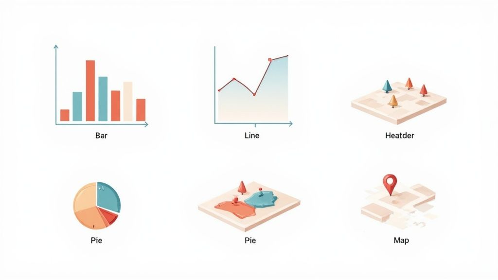
- Match the Chart to the Data's Story: Use line charts for trends over time, bar charts for comparisons, scatter plots for relationships between variables, and maps for geographical data. Define the key question you want to answer first.
- Avoid Common Pitfalls: Be wary of pie charts for more than a few categories, as comparing slice sizes is difficult. Also, avoid 3D charts, which can distort perception and obscure true values.
- Keep It Clean and Clear: Follow Edward Tufte’s "data-to-ink ratio" principle by removing any visual elements that don't represent data, like excessive gridlines or decorative backgrounds. Ensure all charts have clear titles and labeled axes.
- Use Color with Purpose: Leverage color to highlight key data points or create distinctions, not for decoration. When building a dashboard, for instance, you can learn more about how marketing analytics uses color to differentiate campaign performance.
4. Reduce Cognitive Load Through Simplification
Cognitive load is the total amount of mental effort being used in a person's working memory. In dashboard design, a high cognitive load means users must struggle to understand the interface, leaving less mental capacity to interpret the data itself. Reducing this load by simplifying the design is a core tenet of effective dashboard design best practices, ensuring users can focus on insights, not on figuring out how to use the tool.
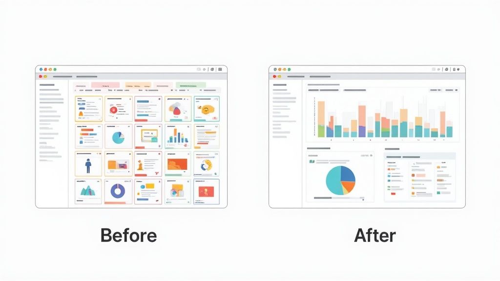
This principle, famously articulated by Steve Krug in his book Don't Make Me Think, argues that every unnecessary element, confusing label, or complex interaction adds to the user's mental strain. A simplified dashboard removes this friction, making the path to data comprehension intuitive and immediate. By ruthlessly eliminating clutter, you create an experience that feels effortless and powerful.
Why It's a Top Practice
Minimizing cognitive load directly boosts user efficiency and reduces the likelihood of errors. When a dashboard is simple, users can complete their tasks faster and with greater confidence. For instance, Stripe’s dashboard presents a clean, focused view on its homepage with only the most essential metrics, hiding more complex reporting and settings in secondary navigation. This approach prevents new users from feeling overwhelmed and guides them toward core actions.
Actionable Implementation Tips
To effectively reduce cognitive load in your dashboard design, apply these simplification strategies:
- Follow the 'Less is More' Principle: Scrutinize every single element on the screen. Ask yourself, "Does this UI component help the user make a better decision?" If the answer is no, remove it.
- Use Progressive Disclosure: Don't show everything at once. Hide advanced or less-frequently used features behind a "Details" or "Advanced Settings" toggle. This keeps the primary interface clean for the majority of users and use cases.
- Implement Modular Design: Allow users to add, remove, or rearrange widgets. This empowers them to create a personalized view that shows only the information relevant to their specific role, effectively cutting out the noise.
- Limit Choices and Actions: Avoid presenting too many filters, controls, or clickable elements simultaneously. Group related actions and use clear, concise labels to guide the user without causing decision paralysis.
5. Ensure Consistent Color and Design Systems
A design system is the single source of truth that groups all the elements that will allow teams to design, realize, and develop a product. It establishes a unified visual language through a cohesive color palette, typography scale, spacing system, and reusable component library. This consistency is a cornerstone of effective dashboard design best practices, as it reduces cognitive load and builds user familiarity, making the interface feel intuitive and predictable.
When every button, chart, and font style adheres to a predefined standard, users don’t have to relearn how the interface works in different sections. This principle, championed by thought leaders like Brad Frost with his "Atomic Design" methodology, scales quality and efficiency. It ensures that as a dashboard grows in complexity, the user experience remains coherent and professional, reinforcing trust in the data presented.
Why It's a Top Practice
Implementing a design system directly impacts both development speed and user experience. It eliminates guesswork for designers and developers, preventing inconsistencies that erode usability. Leading examples like Google's Material Design and IBM's Carbon Design System demonstrate how a robust system creates a seamless, branded experience across complex product ecosystems. This is a vital part of building brand consistency across all digital touchpoints.
Actionable Implementation Tips
To create and maintain a consistent design system for your dashboard, follow these strategies:
- Establish a Limited Color Palette: Define a core set of 3-5 primary and secondary colors, along with neutrals for text and backgrounds. Assign specific meanings to colors, such as using red for alerts or errors and green for success states.
- Document Everything: Create a living style guide or documentation site that details every component, color, typography rule, and spacing unit. This central resource is crucial for team alignment.
- Build a Reusable Component Library: Use tools like Figma or Sketch to create a library of reusable UI components (e.g., buttons, cards, date pickers). This ensures visual and functional consistency across the entire application. To help ensure consistency and scalability across your dashboards, consider utilizing robust user interface design frameworks.
- Prioritize Accessibility: Integrate accessibility standards from the start. Ensure all color combinations meet WCAG contrast ratio guidelines and that components are designed for keyboard navigation and screen readers.
6. Provide Real-Time Data and Refresh Strategies
A dashboard's value is directly tied to the timeliness of its data. This practice involves displaying information that is current enough for the user's specific goals, which requires a deliberate approach to data updates. Implementing an effective refresh strategy balances the need for currency against performance trade-offs like system load and user experience, ensuring the data is both relevant and reliable.
Simply defaulting to "real-time" isn't always the best solution; it can be resource-intensive and unnecessary. The core principle is to align the data's freshness with the speed at which decisions are made. A stock trading dashboard demands second-by-second updates, while a weekly marketing performance review does not. This thoughtful balance is a hallmark of professional dashboard design best practices.
Why It's a Top Practice
An appropriate data refresh strategy ensures the dashboard remains a credible, trustworthy tool for decision-making. If the data is stale, users may make flawed judgments or abandon the tool altogether. For instance, monitoring tools like Datadog or New Relic rely on near-instant updates to alert engineers to critical system failures, where a few minutes of delay could be catastrophic. Conversely, a well-managed refresh cycle prevents performance degradation, ensuring the dashboard remains fast and responsive.
Actionable Implementation Tips
To implement a smart data refresh strategy, focus on the user's context:
- Match Refresh Rate to Need: Align the update frequency with the decision-making cycle. Use true real-time updates (via WebSockets) for financial tickers, second-level refreshes for system monitoring, and periodic 5-15 minute updates for operational analytics where trends matter more than instantaneous values.
- Clearly Display Timestamps: Always show a "Last updated at..." timestamp. This simple addition builds user trust by providing transparency and context about the data's freshness.
- Provide Visual Feedback: Use subtle loading spinners or skeleton screens to indicate that data is being refreshed. This manages user expectations and prevents them from thinking the dashboard is frozen or broken.
- Cache Data Intelligently: Implement caching on both the server and client sides to reduce redundant database queries and server load. This dramatically improves performance, especially for dashboards with many concurrent users.
- Consider Event-Driven Updates: Instead of polling the server at fixed intervals, use event-driven architectures where the server pushes updates only when new data is available. This is far more efficient for many use cases.
7. Enable Interactivity and Drill-Down Capabilities
A static dashboard presents a single, high-level story. An interactive one invites users into a conversation with their data. Enabling interactivity and drill-down capabilities transforms a dashboard from a passive report into an active, dynamic tool for exploration and analysis. By giving users controls like filters, sorting, and clickable elements, you empower them to ask and answer their own follow-up questions directly within the interface.
This approach is central to self-service analytics. Instead of creating dozens of pre-defined, static reports for every conceivable question, you provide a flexible environment where users can segment, pivot, and explore. This not only satisfies user curiosity but also significantly reduces the burden on data teams to fulfill one-off requests, making it a cornerstone of modern dashboard design best practices.
Why It's a Top Practice
Interactivity dramatically increases user engagement and the overall utility of a dashboard. When users can manipulate the data, they build a deeper understanding and trust in the insights presented. For instance, an e-commerce dashboard that allows a manager to drill down from total sales to a specific region, then filter by product category, and finally see the trend for a single item provides layers of actionable insight that a static view could never achieve. Platforms like Tableau and Looker have built their success on this principle, turning users from data consumers into data explorers.
Actionable Implementation Tips
To effectively build interactivity into your dashboard design, consider these strategies:
- Provide Intuitive Controls: Use familiar UI elements like dropdown menus for categories, radio buttons for single selections, and intuitive date pickers. Avoid custom or ambiguous controls that require a learning curve.
- Offer Clear Visual Feedback: Always make it obvious which filters or parameters are currently active. This can be done through "pills" or a summary text at the top, such as "Showing data for: North America, Q4 2023".
- Enable Drill-Downs on Visuals: Allow users to click on a chart segment (like a bar or a pie slice) to filter the rest of the dashboard or navigate to a more detailed view of that specific data point.
- Include a "Reset" Function: A highly visible "Clear Filters" or "Reset to Default" button is crucial. It gives users the confidence to explore freely, knowing they can easily return to the original state with a single click.
8. Prioritize Accessibility and Inclusive Design
Accessibility is not an optional feature; it's a fundamental aspect of high-quality dashboard design best practices. Inclusive design ensures that dashboards are usable by everyone, regardless of their abilities, including users with visual, motor, auditory, or cognitive impairments. By designing for accessibility, you not only comply with legal standards but also create a more robust and user-friendly experience for your entire audience.
Adhering to established guidelines like the Web Content Accessibility Guidelines (WCAG) transforms your dashboard from a potential barrier into an empowering tool. This approach forces clarity and simplicity, which benefits all users by making data easier to interpret and interact with. It's about extending the power of data insights to the widest possible audience.
Why It's a Top Practice
An accessible dashboard broadens your potential user base and is often a legal or contractual requirement, especially for government, healthcare, and educational sectors. For SaaS products, it's a critical differentiator that demonstrates a commitment to all users. Microsoft’s Power BI, for instance, has built-in accessibility features like screen reader support and high-contrast modes, making it a preferred tool in enterprise environments where compliance is mandatory.
Actionable Implementation Tips
To build a truly inclusive and accessible dashboard, implement these strategies:
- Adhere to WCAG Standards: Use WCAG 2.1 Level AA as your minimum benchmark. This provides a clear, globally recognized framework for creating accessible digital products.
- Don't Rely Solely on Color: Use patterns, textures, icons, and direct labels to differentiate data series in charts. This ensures that users with color vision deficiencies can still interpret the information correctly.
- Ensure Full Keyboard Navigability: All interactive elements, from filters to chart tooltips, must be reachable and operable using only a keyboard. Ensure focus indicators are always clearly visible.
- Provide Text Alternatives: Every non-text element, especially data visualizations, must have a text alternative (alt text). For complex charts, provide a summary of the key insights and a link to the underlying data table.
- Use Semantic HTML and ARIA: Structure your dashboard with proper semantic HTML (e.g.,
<nav>,<main>,<section>) and use ARIA (Accessible Rich Internet Applications) roles and properties to add context for assistive technologies like screen readers.
9. Implement Smart Alerting and Conditional Formatting
Smart alerting and conditional formatting transform a dashboard from a passive reporting tool into an active, proactive monitoring system. Instead of forcing users to constantly scan for problems, these features automatically draw attention to critical data points, anomalies, and met thresholds that require immediate action. This is a core tenet of effective dashboard design best practices, as it reduces cognitive load and accelerates response times.
This practice moves beyond static visualization by adding a layer of automated intelligence. It uses pre-defined rules to change a metric's appearance (e.g., turning a number red when it drops below a target) or to trigger a notification (e.g., sending an email when CPU usage exceeds 90%). It’s about making the data speak up when it has something important to say.
Why It's a Top Practice
Proactive alerting is crucial in time-sensitive environments where a missed insight can lead to significant consequences. It ensures that users are notified of issues the moment they occur, enabling faster decision-making. For instance, an infrastructure monitoring dashboard that alerts an engineer to high server latency can prevent a site-wide outage, while a sales dashboard highlighting a region falling behind its quota prompts immediate managerial intervention.
Actionable Implementation Tips
To implement alerts and formatting that empower rather than annoy, follow these guidelines:
- Avoid Alert Fatigue: Be highly selective about what triggers a notification. Start with only the most critical, high-impact metrics. Bombarding users with low-priority alerts will cause them to ignore all of them.
- Use Severity Levels: Categorize alerts to provide immediate context. Use distinct colors or icons for different levels like Informational (blue), Warning (yellow), and Critical (red). This helps users prioritize their focus instantly.
- Make Alerts Actionable: An alert should do more than just state a problem. Include context, such as the metric's baseline value, the duration of the anomaly, and ideally, a link or suggested next step to investigate or resolve the issue.
- Allow User Configuration: Empower users to set their own alert thresholds and notification preferences. The definition of "critical" for a senior executive may differ from that of a frontline analyst, so customization is key to relevance and user adoption.
10. Document Context, Definitions, and Data Lineage
A dashboard showing accurate numbers is only half the battle; users must also understand and trust what those numbers mean. Providing clear context, definitions, and data lineage is a critical dashboard design best practice that transforms ambiguous metrics into a reliable source of truth. This involves documenting what data is being shown, how it is calculated, its source, and how frequently it is updated.
When a user questions a metric like "Active Users," they need to know if it means users who logged in today, this week, or this month. Without clear definitions, different teams can misinterpret the same data, leading to misaligned strategies and flawed decisions. Building this layer of documentation directly into the UI prevents confusion and fosters confidence in the data presented.
Why It's a Top Practice
Transparent documentation democratizes data understanding and significantly reduces support tickets and internal clarification requests. It empowers users to self-serve with confidence, knowing exactly what they are looking at. For example, a Looker dashboard allows developers to embed field descriptions that appear on hover, while Mixpanel often includes sidebars explaining the methodology behind its cohort and funnel reports. This practice is essential for building user trust and ensuring data is used correctly for strategic planning.
Actionable Implementation Tips
To effectively document your dashboard's data, integrate these strategies:
- Provide Inline Definitions: Use tooltips or small info icons next to metric titles. When a user hovers or clicks, a concise pop-up should explain the metric's definition, calculation method, and business relevance.
- Clarify Data Freshness: Explicitly state when the data was last updated (e.g., "Updated 5 minutes ago" or "Data reflects EOD yesterday"). This manages user expectations about data latency.
- Explain Filters and Transformations: If the data displayed has been filtered (e.g., "excluding internal test accounts"), make that context visible. Transparency about transformations is key to accurate interpretation.
- Create a Centralized Glossary: For complex dashboards with many unique terms, link to a centralized data dictionary or knowledge base. This can also be a space to elaborate on the value of B2B data enrichment and how it refines the metrics shown.
10-Point Dashboard Design Comparison
| Practice | Implementation complexity | Resource requirements | Expected outcomes | Ideal use cases | Key advantages |
|---|---|---|---|---|---|
| Establish Clear Visual Hierarchy | Low–Medium (design decisions, testing) | Designer time, user testing | Faster insight; prioritized information | KPI dashboards, executive summaries | Reduces cognitive load; highlights priorities |
| Implement Responsive and Adaptive Design | High (layout logic, cross-device testing) | Frontend dev, QA on devices | Consistent UX across screen sizes | Mobile + desktop audiences, field users | Broad device reach; future-proofing |
| Use Appropriate Data Visualization Types | Medium (chart selection, labeling) | Data expertise, viz tools | Clearer comprehension; accurate patterns | Trend analysis, comparisons, exploratory reports | Improves pattern recognition; reduces misinterpretation |
| Reduce Cognitive Load Through Simplification | Medium (prioritization, modular UI) | Design effort, user research | Faster decisions; fewer errors | Beginner users, high-frequency tasks | Increases usability and adoption |
| Ensure Consistent Color and Design Systems | Medium–High (system creation & governance) | Design system, tooling, documentation | Faster development; unified UI | Large products, multi-team projects | Scales design; improves maintainability and brand cohesion |
| Provide Real-Time Data and Refresh Strategies | High (infrastructure, sync) | Backend engineering, monitoring, cost | Timely decisions; reduced stale data risk | Monitoring, ops, trading platforms | Enables immediate action; increases trust |
| Enable Interactivity and Drill-Down Capabilities | High (UX design, performance tuning) | Dev effort, backend optimizations | Deeper exploration; self-service analytics | Analyst workflows, investigative tasks | Empowers users; lowers analyst dependency |
| Prioritize Accessibility and Inclusive Design | Medium–High (standards compliance, testing) | Accessibility experts, testing tools | Broader access; legal compliance | Public dashboards, healthcare, government | Inclusive UX; improves usability for all users |
| Implement Smart Alerting and Conditional Formatting | Medium (rule design, delivery paths) | Rule configuration, notification infra | Faster incident response; prioritized attention | Ops monitoring, SLA tracking, sales thresholds | Proactive notifications; reduces constant monitoring |
| Document Context, Definitions, and Data Lineage | Medium (ongoing documentation) | Data owners, documentation tooling | Fewer misinterpretations; auditability | Cross-team reporting, regulated environments | Improves data literacy; builds trust in metrics |
Build Dashboards That Drive Decisions, Not Distraction
The journey from raw data to actionable insight is paved with intentional design choices. As we've explored, a truly effective dashboard is far more than a collection of charts and numbers; it's a carefully orchestrated experience designed to empower users, clarify complexity, and accelerate decision-making. By thoughtfully implementing the dashboard design best practices discussed throughout this guide, you can transform your product's analytics from a passive reporting tool into an indispensable strategic asset for your users.
Remember, the ultimate goal is not just to present information, but to facilitate understanding. A dashboard cluttered with vanity metrics or confusing visualizations becomes a source of friction, undermining user confidence and hindering progress. Conversely, a dashboard built on a foundation of clarity, purpose, and user-centricity becomes a catalyst for growth and success.
Synthesizing the Core Principles
Let's distill the critical takeaways from our exploration. A successful dashboard is not built on a single brilliant feature, but on the harmonious integration of multiple core principles.
- Clarity Above All: The foundation of any great dashboard is its ability to communicate information quickly and unambiguously. This is achieved through a strong visual hierarchy, logical information grouping, and the strategic use of white space to guide the user's eye. Every element should have a clear purpose.
- Accessibility and Inclusivity: Design is for everyone. Prioritizing accessibility with high-contrast color palettes, screen reader compatibility, and clear labeling isn't just a compliance issue; it’s a commitment to creating a product that serves the widest possible audience effectively.
- Interactivity with Purpose: Empowering users to explore their data is key to unlocking deeper insights. Features like drill-downs, date-range filtering, and segmentation transform a static report into a dynamic analytical workspace. The key is to make this interactivity intuitive, ensuring users can find answers without needing a manual.
- Trust and Context: Data without context is just noise. By providing clear metric definitions, documenting data lineage, and implementing smart alerting systems, you build trust. Users need to be confident that the data they are seeing is accurate, timely, and relevant to their objectives.
Key Insight: The most powerful dashboards are not static artifacts but living, breathing interfaces that evolve with user needs. They anticipate questions, provide context, and guide users toward meaningful action.
From Good to Great: The Personalization Advantage
For SaaS and developer-focused platforms, one of the most powerful levers for elevating the user experience is immediate, effortless personalization. While all the principles we've covered are crucial for building a solid foundation, creating a sense of ownership from the very first login can dramatically accelerate user activation and long-term engagement.
Imagine a new team signing up for your service. Instead of landing on a generic, one-size-fits-all dashboard, they are greeted by an interface already branded with their company's logo and color scheme. This isn't just a superficial aesthetic touch; it's a powerful psychological signal that your platform is an integrated part of their workflow. This is where modern tools can automate what was once a complex, manual process. Integrating an API to fetch brand data allows you to dynamically theme a user's entire environment in seconds, making them feel at home and demonstrating the power of your platform from moment one.
Ultimately, mastering these dashboard design best practices is about respecting your users' time and cognitive energy. Your goal is to build an interface so intuitive and insightful that it becomes an invisible, indispensable partner in their success.
Ready to elevate your dashboards with effortless, instant personalization? Brand.dev provides a simple API that fetches any company's logo, colors, and other brand assets, allowing you to automatically theme user interfaces and create a bespoke experience from the moment of signup. Visit Brand.dev to see how you can reduce time-to-value and boost user engagement today.