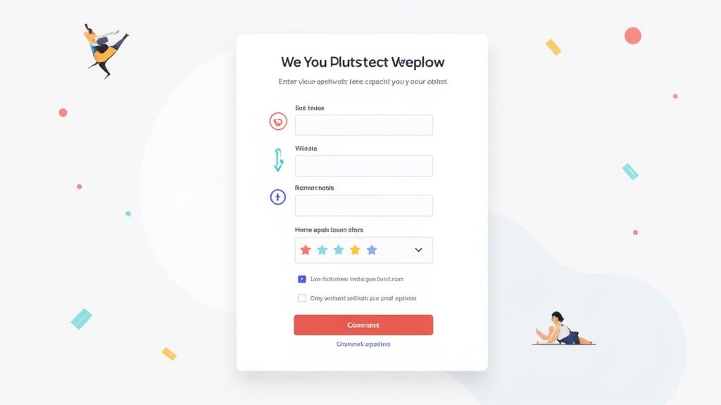
At its most basic, a lead capture form is just a set of fields on a website where visitors can enter their contact info. They do this in exchange for something valuable, maybe an ebook, a product demo, or a spot on your newsletter list. It’s the single most important tool for turning anonymous website visitors into actual, qualified leads for your sales and marketing teams.
The Digital Handshake Your Business Needs

Don't think of a lead capture form as just a data-entry box. It's really more of a digital handshake. This is the first moment a potential customer voluntarily raises their hand and says, "Hey, I'm interested in what you're doing." It's your first real, direct point of contact.
This simple exchange is the engine that powers modern marketing. Without a solid way to collect and organize interest, businesses are just guessing who’s actually listening. A well-designed form acts as your best digital receptionist, efficiently grabbing the details you need to kickstart your entire sales funnel.
Why Every Business Needs Lead Capture Forms
Every lead capture form is built on a simple value exchange. The visitor gives you their information (a valuable asset), and you give them a resource, a solution, or the promise of future value. This agreement is ground zero for building a relationship founded on trust.
The market stats back this up. The global market for lead capture software, valued around USD 2.8 billion in 2025, is on track to more than double to USD 5.8 billion by 2035. That kind of growth shows just how central these forms are to business strategy. You can read the full research about lead capture software market trends to see where the industry is headed.
A lead capture form transforms passive website visits into active business opportunities. It’s the bridge between audience engagement and revenue generation, making it a non-negotiable tool for sustainable growth.
But these forms do more than just collect emails. When done right, they help you:
- Segment Your Audience: By asking a few smart questions, you can start bucketing leads based on their needs, industry, or interests. This is the key to truly personalized marketing.
- Qualify Potential Customers: The information gathered helps you figure out if a lead is a good fit for your product, saving your sales team a ton of time.
- Fuel Nurture Campaigns: Once a lead is captured, you can drop them into automated email sequences that guide them along their journey, building trust and rapport along the way.
To give you a clearer picture, here’s a quick breakdown of what makes a form effective.
Core Components of an Effective Lead Capture Form
This table summarizes the essential elements that every successful lead capture form should have, explaining the role each component plays.
| Component | Primary Function | Key Objective |
|---|---|---|
| Headline & Sub-headline | Grabs attention and communicates the core value proposition. | Clearly answer "What's in it for me?" for the visitor. |
| Input Fields | Gathers specific information from the visitor. | Collect just enough data to qualify and contact the lead. |
| Call to Action (CTA) Button | Prompts the user to submit the form. | Motivate action with clear, compelling, and specific text. |
| Value Offer | Provides the incentive for the user to share their data. | Deliver a resource so valuable the exchange feels like a no-brainer. |
| Privacy Policy Link | Assures users their data will be handled responsibly. | Build trust and ensure legal compliance. |
Each part has a job to do, and when they all work together, the result is a smooth, trust-building experience for your visitors.
Mastering the art and science of the lead capture form isn't just a marketing task, it's a core business function. It’s where psychology, user-centric design, and smart strategy meet to create a predictable pipeline of potential customers, turning your website traffic into a measurable asset.
Designing Forms People Want to Complete
A great lead capture form is more than a list of questions. It's a conversation. The real goal is to make the experience so smooth and intuitive that people fill it out without even thinking twice. This isn't luck, it's the result of smart design that respects the user's time and attention.
Think of a user’s patience like a fuel tank. Every confusing question, clunky field, or moment of hesitation drains that tank. Once it’s empty, they’re gone. Good design is all about preserving that fuel, guiding them effortlessly from the first field to the final click.
Creating a Frictionless Journey
Your first big design decision is about structure: are you building a one-page sprint or a multi-step marathon? A single-step form lays out all the questions at once. This is perfect for short, simple requests, like a newsletter signup that only needs an email address. Get in, get out.
On the other hand, a multi-step form breaks down longer requests into bite-sized pieces. This strategy is brilliant for reducing that initial "Ugh, this is too much work" feeling. Asking for a name and email on the first screen feels way less intimidating than staring down a dozen fields all at once.
Regardless of the structure you choose, some layout rules are non-negotiable:
- Single-Column Layout: Always stick to one vertical column. This gives the user’s eye a clean, predictable path to follow down the page, killing the confusion that comes from zig-zagging between fields.
- Logical Grouping: Bundle related fields together. "Contact Info" goes here, "Company Details" go there. It just makes sense and helps the user mentally organize the task.
- Visual Cues: For multi-step forms, a progress bar is your best friend. It shows people exactly where they are and how much is left, which is a surprisingly powerful way to keep them from bailing.
Great design is also about accessibility. Folding in inclusive design principles ensures your forms are easy for everyone to use, not just a select few.
Crafting Compelling Copy
The words on your form carry just as much weight as the layout. Your two most important pieces of real estate are the headline and the call-to-action (CTA) button. The headline needs to answer one question immediately: "What's in it for me?" It should be short, punchy, and scream value.
The CTA button is the final gatekeeper. Ditch generic words like "Submit" or "Send." Instead, use action-oriented text that reinforces exactly what the user is getting.
Example CTAs:
- Instead of "Submit," use "Get My Free Ebook"
- Instead of "Register," use "Reserve My Webinar Seat"
- Instead of "Download," use "Start My Free Trial"
This simple switch connects the click directly to the reward, making it an easy and satisfying decision.
Building Unbreakable Trust
People are rightfully protective of their personal data. Before they share anything, they need to trust you. Your form is often the first test of your credibility.
The easiest way to build that trust is by showing you're legit.
First, sprinkle in some social proof right next to the form. This could be a short customer testimonial, a few logos of companies you work with, or a simple line like, "Join 50,000+ subscribers." It’s a powerful signal that they’re in good company.
Next, add security seals or trust badges, especially if you're asking for sensitive info. A lock icon or a familiar logo from a service like Norton or McAfee goes a long way. Finally, always link to your privacy policy. Being transparent about how you handle data is one of the fastest ways to show users you're trustworthy, making them far more likely to hit that button and start a real relationship with your brand.
Choosing the Right Fields to Maximize Conversions
Every field you add to a form introduces a tiny bit of friction. Think of it as a small cost you're asking visitors to pay with their time and attention. Ask for too much upfront, and they’ll simply walk away, leaving another abandoned cart in their wake.
The trick is finding that sweet spot between gathering the essential data your team needs and making the process feel effortless for the user. One well-known study found that slashing form fields from 11 down to just 4 boosted conversions by an incredible 120%. It’s a powerful reminder of a simple truth: less is almost always more.
Your goal is to match the size of your "ask" to the value of your "offer." The more valuable the prize, the more information someone is willing to share to get it.
Aligning Form Fields with Offer Value
A demo request isn't the same as a newsletter signup, so why would the forms be identical? The visitor's mindset and stage in their journey directly influence how much they're willing to give you. A casual browser is just kicking the tires; someone requesting a quote is ready to talk specifics.
It's like any new relationship, you don't ask for a long-term commitment on the first date. A top-of-funnel offer should feel just as low-stakes.
Here’s how to think about it at each stage:
- Top of Funnel (Awareness): When the offer is a blog subscription or a simple checklist, keep the form radically simple. Often, a single email address field is all you need. The goal here is to make saying "yes" an absolute no-brainer.
- Middle of Funnel (Consideration): For a detailed ebook or a webinar registration, the user is showing deeper interest. Now, it's fair to ask for a first name and email address. You might even add an optional field for their company name to help with qualification.
- Bottom of Funnel (Decision): This is for high-intent actions like a demo request or a sales call. The user is actively looking for a solution and expects to provide more detail. Here, you can confidently ask for qualifying info like name, company, job title, phone number, and company size.
The rule of thumb is simple: The amount of data you request should never exceed the perceived value of what you're giving in return. If the exchange feels unbalanced, your form abandonment rate will tell the story.
This approach doesn't just improve completion rates, it respects the user's journey and builds trust by asking for the right information at the right time.
Essential Fields vs. Optional Fields
Once you've tailored the form to the offer, it's time to get ruthless with your fields. Every single question must justify its existence. Sort your fields into two piles: the "must-haves" and the "nice-to-haves."
The "must-haves" are the absolute bare minimum required to take the next step. For most B2B companies, that’s a name and an email. Everything else is a bonus. A well-structured form that focuses on the essentials is a cornerstone of improving SaaS conversion rates.
After you’ve got your essentials locked in, scrutinize every other field. Ask your team, "Do we absolutely need this piece of information right now to qualify or route this lead?" If the answer is no, make it optional or kill it. For instance, making "Phone Number" optional allows motivated leads to offer it up while preventing it from becoming a roadblock for those not ready for a call.
Using Advanced Logic for Smarter Forms
Why stick with static forms when you can create dynamic, responsive experiences? Two techniques are perfect for this: smart fields and conditional logic.
Smart fields, also known as progressive profiling, are a game-changer for nurturing leads. The form intelligently detects if a visitor has already given you certain information (like their name) on a previous visit. It then hides those known fields and shows new, more qualifying questions instead. This lets you build a rich profile over time without ever asking for the same data twice.
Conditional logic turns your form into an interactive conversation. The fields a user sees change in real-time based on their answers.
For example:
- A user selects "Marketing" from a "Department" dropdown...
- ...and a new field instantly appears asking about their biggest marketing challenge.
- If they had chosen "Sales," they would have seen a different, more relevant question.
This makes the form feel tailored and personal. It shortens the experience for most users, fights off form fatigue, and dramatically improves the quality of the data you collect by asking the right questions to the right people.
Where to Place Your Form for Maximum Impact
You could design the world’s most beautiful, frictionless lead capture form, but if it’s buried on a page nobody visits, it might as well be invisible. The art of form placement is all about understanding your user’s journey and meeting them at the right place, at the right time.
Think of your website like a physical retail store. You wouldn't hide the checkout counter in a back closet, right? Your most important forms need to be in high-traffic, high-visibility spots where interested people are naturally going to find them.
High-Impact Locations on Your Website
Your website is a network of opportunities. Different pages attract visitors with different mindsets, and your form placement should reflect that. Instead of just one form, think about creating a system of capture points that work together.
Here are a few prime locations to consider:
-
Homepage Hero Section: This is your digital storefront. A simple, high-value offer here, like a newsletter signup or a free trial, is perfect for grabbing immediate attention from new arrivals. It’s your broadest net.
-
Dedicated Landing Pages: These are the specialists. Built for a single purpose, like a webinar signup or an ebook download, landing pages are ruthlessly focused on conversion. They strip away all distractions, making them the most effective place for more detailed forms.
-
Content Upgrades in Blog Posts: Someone reading a 2,000-word guide on a niche topic is already highly engaged. Offering a relevant "upgrade", like a checklist, template, or PDF version of the article, in exchange for an email is an incredibly powerful tactic.
-
Exit-Intent Pop-ups: Just as a visitor is about to click away, an exit-intent pop-up gives you one last chance to make an offer. It’s a great way to capture leads you would have otherwise lost, often with a compelling discount or a valuable resource.
Matching Placement to User Intent
Not all visitors are on the same mission. Someone casually browsing your blog is in a completely different headspace than someone comparing features on your pricing page. Your form’s placement needs to respect that context.
A low-commitment newsletter signup in the footer, for instance, is perfect for capturing passive interest. It doesn't interrupt their flow, but it's always there, consistently pulling in leads from visitors who aren't quite ready for a sales conversation.
On the other hand, a form on your pricing or features page can and should be more direct. Here, you have a high-intent audience actively evaluating your solution. They're much closer to making a decision, so asking for more qualifying information feels natural because the value exchange is clear.
Placing a lead capture form is about aligning your offer with the user's immediate goal. Meet them where they are in their journey, whether they're just exploring or are ready to buy, and you'll see your conversion rates climb.
The table below breaks down how different placements align with user intent and what kind of results you can typically expect.
Lead Capture Form Placement and Expected Conversion Impact
| Placement Location | Primary User Intent | Typical Lead Quality | Best For |
|---|---|---|---|
| Homepage Hero | Exploration & First Impression | Low to Medium | Broad brand awareness, newsletter signups, top-of-funnel offers. |
| Dedicated Landing Page | High Intent & Evaluation | High | Gated content (ebooks, webinars), demo requests, free trial signups. |
| Blog Post Content Upgrade | Problem-Solving & Learning | Medium to High | Building a targeted email list, nurturing leads with relevant content. |
| Pricing/Features Page | Comparison & Purchase Intent | Very High | High-quality sales leads, demo requests, direct purchase funnels. |
| Exit-Intent Pop-up | Leaving Site (Low Intent) | Low to Medium | Retaining visitors, last-chance offers, capturing otherwise lost leads. |
| Website Footer | Passive Interest | Low | Consistent, low-friction newsletter or update subscriptions. |
Choosing the right mix of these placements ensures you have a capture point for every type of visitor, maximizing your chances of turning traffic into tangible leads.
Beyond Your Website: Channel-Specific Strategies
Your website isn’t the only game in town. Social media platforms, especially in the B2B world, have become powerful channels for lead generation.
LinkedIn, for example, offers native Lead Gen Forms that can be absolute goldmines. Research shows these forms boast an average conversion rate of around 13%, more than five times higher than a typical landing page. It’s no surprise that 40% of B2B marketers now see LinkedIn as their most effective channel for generating high-quality leads.
The magic is in the experience. By using a native form, you meet prospects directly in their feed and pre-fill their information, removing all the friction of sending them to an external website. You can discover more insights about LinkedIn lead generation to see just how effective it can be.
By combining smart on-site placement with targeted strategies on channels like LinkedIn, you build a robust system that keeps your offers in front of the right people, wherever they are.
Connecting and Automating Your Form
A slick lead capture form is a great start, but its real value comes from what happens after someone hits "submit." An unconnected form is like a receptionist jotting down a lead's number on a sticky note that gets lost on their desk. The opportunity goes cold, fast.
Connecting your form to your other business tools turns it from a simple data collector into an automated growth engine. It closes the loop between a potential customer raising their hand and your team starting a meaningful conversation. This is all about building a seamless workflow that captures, qualifies, and nurtures every single lead without anything falling through the cracks.
This flow chart gives you a bird's-eye view of how forms placed across your site can all feed into one central system.
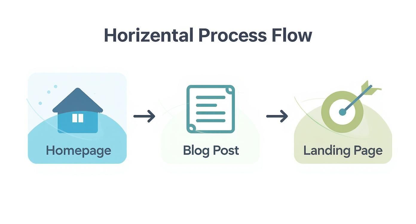
Whether it’s on your homepage, a blog post, or a dedicated landing page, every form should be part of a single, unified lead generation machine.
Building a Bulletproof Technical Foundation
Before you can think about automation, you need to get the technical basics right. A few key elements will make your form reliable, secure, and easy to use on any device. These aren't just details for developers to worry about; they have a direct impact on your conversion rates and the quality of the data you collect.
-
Real-Time Field Validation: Don't make people wait until they submit the form to find out they typed their email wrong. Instant validation gives immediate feedback as they type, flagging errors like "Invalid email format" right away. This tiny touch prevents a ton of frustration and dramatically cuts down on submission errors.
-
Robust Spam Protection: Spam submissions are more than just an annoyance, they can corrupt your data and waste your team's valuable time. While CAPTCHAs are an option, a much slicker method is a honeypot field. It's a hidden form field that real users can't see, but spam bots will fill it out. If that field has data in it, you know it's spam and can reject it automatically.
-
Mobile Responsiveness: A huge chunk of your traffic is on mobile. A form that's a nightmare to use on a phone is a guaranteed conversion killer. Make sure your layout, fields, and buttons adapt perfectly to any screen size for a smooth experience, no matter the device.
Creating an Automated Lead Management Workflow
Once your form is technically solid, it's time to put it to work with automation. The goal here is to instantly get new leads into the right hands for a speedy response. In fact, research shows that following up with a lead within 10 minutes or less is absolutely critical.
The most important connection you'll make is to your Customer Relationship Management (CRM) platform. By integrating your form directly with a tool like HubSpot or Salesforce, a new contact record is created the second a lead is captured. This gives your sales team everything they need for an immediate, informed follow-up. To really get the most out of this, it helps to understand how to automate lead generation with Google Ads so that data flows smoothly from your ads right into your systems.
Beyond the CRM, connecting your form to an email marketing platform unlocks a few more powerful automations:
- Trigger a Welcome Sequence: Instantly send a "thank you" email that delivers whatever you promised (like an ebook or a webinar link) and sets the stage for what comes next.
- Start a Nurture Campaign: Add the new lead to an email series designed to educate them and guide them further down the funnel.
- Notify the Right Team Member: Automatically ping a specific salesperson based on the lead's industry, company size, or other criteria.
Reducing Friction with Prefilled Fields
Nothing kills momentum like asking a returning visitor for information you should already have. This is where pre-filling form fields becomes a secret weapon for improving the user experience.
Think about it: when a user comes back to your site and sees a form with their name, email, and company already filled in, the process feels effortless. This simple act of personalization can give your completion rates a serious boost.
Tools like the Brand.dev API take this concept even further. By just asking for a work email, you can instantly pull in the person's company name, logo, and other key details. This means you can ask for less information upfront while actually getting richer, more accurate data on the backend. For more on this, check out our guide on how to identify anonymous website visitors and create a more personalized journey from the start.
How to Measure and Optimize Form Performance
A high-performing lead capture form is never really "done." Think of it less like a static page and more like a living asset that needs constant tuning to hit its peak. Just launching a form and hoping for the best is a surefire way to leave leads on the table. You need a data-driven way to measure, test, and refine every single element.
That whole process starts with tracking the right numbers. Without clear data, any changes you make are just shots in the dark. Focus on a few key performance indicators (KPIs) that tell you the real story of how your form is actually doing.
Key Metrics to Track
To get a handle on your form's health, you have to monitor its vital signs. These metrics give you a clear, quantitative look at user behavior and overall effectiveness, helping you pinpoint exactly where to focus your optimization efforts.
-
Conversion Rate: This is the big one. It’s the percentage of visitors who see your form and actually complete it. A low conversion rate is a massive red flag that something, whether it’s the offer, the number of fields, or the copy, is creating friction.
-
Form Abandonment Rate: This metric tracks the percentage of people who start filling out your form but bail before hitting submit. A high abandonment rate often points to specific problems, like a confusing field, a technical glitch, or a form that’s just way too long.
-
Cost Per Lead (CPL): If you're running any paid campaigns, CPL is absolutely essential. You calculate it by dividing your total campaign spend by the number of leads you captured. Getting your form to convert better is one of the fastest ways to lower your CPL and seriously improve your return on investment.
A Step-by-Step Guide to A/B Testing
Once you have your baseline metrics, you can start optimizing through A/B testing. This is simply the process of creating two versions of your form (Version A and Version B) and showing each to a different slice of your audience to see which one performs better.
The key to successful A/B testing is to change only one variable at a time. If you change the headline, the CTA color, and the number of fields all at once, you’ll have no idea which change actually made the difference.
Here’s a simple process to follow:
- Form a Hypothesis: Start with an educated guess. For instance, "Changing the CTA button text from 'Submit' to 'Get My Free Ebook' will increase conversions by clarifying the value."
- Create Your Variation: Duplicate your original form (the control) and make that single change to create your new version (the variation).
- Run the Test: Use A/B testing software to split your traffic evenly between the two versions. Let the test run long enough to gather a statistically significant amount of data.
- Analyze the Results: Compare the conversion rates. Did your variation win? If so, that new version becomes your new control for the next test.
By systematically testing individual elements, from headlines and button colors to the number of fields and placement on the page, you can make incremental improvements that lead to significant gains in performance over time.
Using Analytics to Uncover Sticking Points
While A/B testing tells you what is happening, other analytics tools can tell you why. Tools like heatmaps and session recordings provide powerful visual clues into user behavior.
Heatmaps create a visual overlay showing where users are clicking, moving their mouse, and scrolling. They can reveal if people are trying to click on non-clickable elements or completely ignoring your call-to-action button. Session recordings are even more granular, giving you video playbacks of individual user sessions. Watching these can be incredibly revealing, showing you exactly which form field is causing people to hesitate or give up entirely.
Combining these qualitative insights with your quantitative metrics gives you the full picture. This allows you to build a continuous optimization loop where you track data, form hypotheses, test your changes, and analyze the results to inform your next move. This iterative process is the key to transforming your lead capture form from a functional tool into a highly-efficient conversion machine, which in turn fuels your entire marketing operation. Once you've captured those leads, you can learn more about how to personalize email marketing to keep them engaged.
Common Questions, Answered
Even with the best guides, a few questions always pop up. Let's tackle the most common ones we hear about lead capture forms.
How Many Fields Should My Form Have?
There's no magic number here. The real answer is: as few as you absolutely need for the value you're providing. You're always trading data for convenience.
For a simple newsletter sign-up, a single email field is king. Don't ask for a name, a company, or anything else that adds friction. But for a high-intent, bottom-of-the-funnel request like a product demo? Asking for a name, company, and job title is completely fair game, in fact, it's expected.
The secret is to test. Start with the bare minimum. Only add another field if you can prove the extra data is worth a potential drop in your conversion rate.
This way, you're not scaring off new prospects before they even get started.
What’s the Difference Between a Lead Capture Form and a Contact Form?
They might look alike on the surface, but they play completely different roles. A lead capture form is a proactive marketing engine. You use it to turn anonymous visitors into known leads by offering them something valuable, like a free guide or webinar access. The whole point is to build a list you can nurture over time.
A contact form, on the other hand, is a reactive customer service tool. It’s there for people who already have a question or need support. The internal process for handling a "contact us" submission is worlds apart from routing a new marketing lead, and that distinction is key.
How Do I Stop Spam Submissions on My Forms?
Spammy form submissions are the worst, they mess up your data and waste everyone's time. A good defense uses a few layers without getting in the way of real users.
- Set a Honeypot: This is just a hidden field that your human visitors will never see. Bots, however, are dumb and will fill out everything. If that hidden field has an entry, you know it's spam and can toss it automatically.
- Use a Modern CAPTCHA: Google's reCAPTCHA v3 is a fantastic option because it works invisibly in the background. It analyzes user behavior to generate a "human" score instead of forcing everyone to click on pictures of traffic lights.
- Require a Double Opt-In: For any email subscription, this is a must. After someone signs up, they get an email asking them to click a link to confirm their address. It's the single best way to ensure the emails on your list belong to real, engaged people.
Ready to transform your signups and enrich user profiles effortlessly? With Brand.dev, you can use a single email to instantly prefill forms with accurate company logos, names, and more, creating a frictionless onboarding experience. Start personalizing with Brand.dev today.