Let's be honest, most lead capture forms are a massive missed opportunity. They often feel more like a chore for your visitors than a valuable exchange, turning into a leaky bucket where potential revenue just drains away.
The real fix isn't about finding a magic new tool. It’s about shifting your entire perspective from just collecting data to actually starting a conversation.
Why Your Forms Aren't Converting (And How to Fix It)
If you've got solid website traffic but your lead count is depressingly low, your forms are almost certainly the culprit. A clunky, poorly designed form creates just enough friction to make a potential customer give up and leave. This isn't a small problem; it's a direct roadblock stopping you from acquiring new customers.
The problem usually boils down to a few common mistakes that are surprisingly easy to fix. From asking for way too much information upfront to subtle design flaws that frustrate users, these issues are quietly sabotaging your conversion rates.
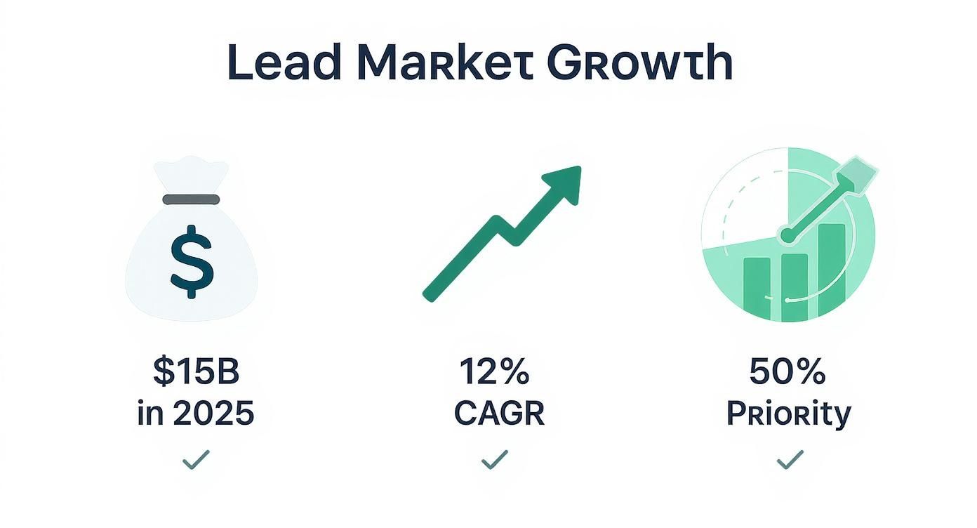
The Real Cost of a Bad Form
A high-friction form doesn't just lose you a single lead. It can actually damage how people see your brand. When someone feels like their time is being wasted or their privacy isn't being respected, they’re far less likely to come back. The goal is to make the exchange feel worthwhile, not invasive.
This is more critical than ever. The global lead management market is on track to hit $15 billion in 2025 and is expected to grow at a 12% compound annual growth rate through 2033. This tells us that finding and converting quality leads is a top priority for half of all marketers, making your form's performance a key business metric. You can find more lead management insights over at crmside.com.
Your form isn't just a series of fields; it's the first handshake with a potential customer. Make it effortless, respectful, and valuable, and you'll see your conversions climb.
Shifting Your Mindset
To really tackle forms that aren't converting, exploring the best lead generation tools can definitely give you an edge. But remember, technology alone isn't the whole answer. The biggest improvements come from a change in strategy.
Stop thinking, "What data can I get from this person?"
Instead, start asking, "What's the absolute minimum I need to ask for to provide value right now?"
This user-centric approach completely reframes the interaction. It forces you to justify every single field, every question, and every step. By focusing on creating a seamless and positive experience, you build trust and encourage people to willingly share their information. That simple form submission then becomes the start of a strong customer relationship.
Designing Forms People Want to Complete
The secret to a high-converting form isn't about flashy design, it's about psychology. A great form anticipates a user's hesitation and makes sharing their information feel like a natural, low-risk conversation. It’s the small, deliberate choices that transform a chore into a seamless experience.
For example, a single-column layout is pretty much non-negotiable these days. With most of us browsing on our phones, a straight line down the page is the fastest, clearest path to completion. Same goes for your field labels; they're way more important than placeholder text, which vanishes the second someone starts typing and forces them to guess what they were supposed to enter.
This is more than just good UX; it's a massive business opportunity.
With the lead market projected to rocket to $15 billion by 2025 and lead conversion being a 50% priority for marketers, you can't afford to get this wrong. Every single field, button, and step in your form is a critical part of your funnel.
Make the First Step Effortless
The order of your form fields has a surprisingly huge impact on whether someone actually finishes. You want to reel them in with the easiest possible ask. Get them invested.
That's why asking for an email address first is a classic, proven move.
One deep dive into 10,000 lead capture forms found that putting the email field right at the top boosted completion rates by 18%. Why? Because it’s a standard, low-threat request we’re all used to. It just feels right.
Start with the easiest piece of information. Once a user has typed even one thing, they've made a micro-commitment and are far more likely to see it through to the end.
This is the old "foot-in-the-door" technique in action. A small, easy request builds the momentum needed to carry a user through the more demanding fields that might come later. For more on this, check out these excellent form design best practices.
Which Fields Actually Matter?
Every field you add introduces friction. The key is knowing which ones are worth the potential drop-off. You need to strike a balance between gathering valuable data and keeping the user's journey as smooth as possible.
Here's a quick breakdown of common fields and their impact:
Form Field Impact on Conversion
| Form Field | Friction Level (Low/Medium/High) | Best Use Case | Alternative Approach |
|---|---|---|---|
| Low | The absolute minimum for any lead capture. | Social sign-on (e.g., Google/LinkedIn). | |
| First Name | Low | Personalizing initial follow-up communications. | Can sometimes be combined into a single "Full Name" field. |
| Company Name | Medium | B2B qualification; understanding your audience. | Use an enrichment tool like Brand.dev to derive it from the email. |
| Phone Number | High | High-intent leads requiring a direct sales call. | Make it optional or ask for it post-signup. |
| Job Title | Medium | Segmenting leads by role or decision-making power. | Offer a dropdown list instead of a free-text field. |
| Company Size | Medium | Qualifying leads for specific sales tiers or plans. | Present as a multiple-choice or dropdown menu. |
| "How can we help?" | Low | Open-ended field to capture user intent in their own words. | Provide checkboxes with common pain points. |
Ultimately, only ask for what you absolutely need at that specific stage. You can always gather more information later on in the customer journey.
Break Down the Ask with Multi-Step Forms
If your form needs more than three or four pieces of information, a long, scrolling list of fields is a conversion killer. It just looks like a lot of work.
This is where multi-step forms are a lifesaver.
By breaking the process down into smaller, bite-sized chunks, you dramatically lower that initial psychological barrier. Instead of one intimidating wall of questions, the user sees a simple starting point. The impact is huge, some companies have seen conversion lifts of up to 300% just by switching from a single-page form to a multi-step one. It turns an interrogation into a guided conversation.
Here’s how to get the most out of them:
- Show a Progress Bar: Give users a visual cue of how far they've come and how close they are to the finish line. It's a powerful motivator.
- Group Related Questions: Dedicate each step to a logical category. Step one could be "Contact Info," followed by "Company Details." This makes the flow feel organized and intuitive.
- Save the Hardest Question for Last: Always put the highest-friction field, like a phone number, at the very end. By that point, the user has already invested their time and is much more likely to complete that final step.
Building Smarter Forms with Automation
Let’s be honest: static lead capture forms are a relic. To actually connect with potential customers today, you need to build intelligent, interactive experiences that adapt to the user in real time. This is about moving beyond basic fields and into functional upgrades that genuinely move the needle on your conversion rates.
Think about the last time you hit "submit" only to see a vague, red error message. It's an instant turn-off. Modern forms completely sidestep this headache with real-time validation, giving users instant, helpful feedback as they type. It guides them to fix small mistakes before they become a point of friction.

This shift toward smarter, more personalized marketing isn't just a trend; it's big business. The lead capture software market hit $2.69 billion in 2024 and is on track to hit $4.55 billion by 2029. That growth is all about the demand for smarter tools and slick integrations with CRM and automation platforms. You can check out more predictions for this space over on superagi.com.
The Art of Progressive Profiling
Why would you ask a returning visitor for the same information you already have? It’s a classic way to make your brand feel disconnected and impersonal. The fix is progressive profiling, which lets you build a much richer customer profile over time without hitting them with a giant form on day one.
Here’s what this looks like in the real world:
- First Visit: Someone signs up for your newsletter with just their email. Easy.
- Second Visit: They come back to download a whitepaper. The form recognizes their email, so it hides that field and asks for their company name and job title instead.
- Third Visit: When they swing by to request a demo, the form only asks for their phone number and company size.
This approach respects the user's time and makes every interaction feel a little smoother and a lot smarter. It shows you're actually paying attention.
The goal of a smart form is to feel like a conversation, not an interrogation. Each question should build on the last, making the user feel understood at every step.
Using Conditional Logic to Ask Better Questions
Not all leads are created equal, so why should your form treat them that way? With conditional logic, you can dynamically change the form's fields based on a user's previous answers. This ensures you’re only ever asking for relevant information.
This is an incredibly powerful way to start segmenting leads right from that very first touchpoint.
For example, a SaaS company’s demo request form could ask, "What is your primary goal?" If a user selects "Improve Team Collaboration," the form could then show a follow-up question about their team size. But if they pick "Automate Marketing Workflows," it might display fields related to their current marketing stack.
This kind of customization not only streamlines the user experience but also hands your sales team highly qualified, contextual information from the get-go. And as you pipe this data into other tools, it's worth learning how to automate your brand workflows with Zapier integrations to enrich that data even further.
Personalizing Forms with Brand.dev
What if your form knew your visitor the second they arrived? This isn't just a gimmick; it's the core of real-time data personalization, and it’s a total game-changer for lead capture forms. Instead of forcing every prospect through the same generic fields, you can create a "wow" moment that feels like it was built just for them.
This is exactly where a tool like Brand.dev shines. Its API turns a simple email input into a powerful personalization engine. The moment a B2B prospect types in their work email, you can fetch their company's name, logo, industry, and even brand colors, all before they even think about hitting submit.
This isn’t about saving someone a few keystrokes. It's about showing you've built a smart, thoughtful system that respects their time and actually knows who they are.
Creating a Hyper-Personalized First Impression
The most potent use of this tech happens right on the form itself. By dynamically updating the UI with data pulled from the prospect’s email domain, you can craft a truly memorable experience.
Here are a few ways I’ve seen this work brilliantly:
- Dynamic Headlines: The instant the API returns a company name, your headline can flip from a generic "Request a Demo" to something punchy like "Great to see you, Acme Corp!"
- Logo Integration: Automatically pull the visitor’s company logo and pop it right onto the form. This visual confirmation builds an immediate sense of recognition and trust.
- Tailored CTAs: Ditch the boring "Submit" button. Your call-to-action can update to something way more specific, like "Get Your Acme Corp Demo."
This level of detail transforms the interaction from a sterile data collection process into a one-to-one conversation. It's a small touch that can make a huge difference in how a prospect sees your brand.
Extending Personalization Beyond the Form
But the experience shouldn't just stop when the user clicks submit. The data you just captured is your ticket to creating a seamless, personalized journey on the very next page.
A great lead capture form is the beginning of a personalized journey, not the end. Use the data you gather to make the next step feel just as customized as the first.
For example, your thank-you page can be instantly customized. Instead of a bland "Thanks for your interest," you can greet them with a page that proudly features their own logo and company name.
You can take this even further down the funnel:
- Customized Asset Delivery: If your offer was a whitepaper or case study, why not dynamically add the prospect's logo to the PDF's cover page before they download it?
- Personalized Demo Links: The confirmation email can include a pre-populated meeting link that mentions their company, like "Your Demo for Acme Corp."
These strategies go way beyond basic form-filling. They signal a deep attention to detail that really sets your brand apart.
For those ready to dive deeper, our guide on how to personalize SaaS onboarding with Brand.dev offers even more advanced techniques that all begin from that initial signup form. By using real-time brand data, you turn a simple form into your most powerful tool for building immediate rapport.
Measuring and Optimizing Form Performance
Building a high-converting form isn't a "set it and forget it" task. The best forms are born from continuous, data-driven improvement. You have to stop guessing and start treating your forms like a product, something you measure, test, and refine over time.
The goal is to move from "I think this will work" to "I know this works because the data says so." It all starts with tracking the right metrics to find the exact points of friction that cause people to bail.
Identifying Your Key Performance Metrics
To get a clear picture of your form's health, you need to zero in on a few critical data points. These tell you not just if your form is working, but where it’s failing. Setting up analytics to monitor these is your first real step toward meaningful optimization. For a solid primer on this, check out our guide on how to track visits to a website.
Here are the essential metrics to watch:
- Form Conversion Rate: This is your north star, the percentage of people who see the form and actually complete it.
- Field Drop-off Rate: This one is crucial. It tells you which specific field makes the most users give up. A high drop-off on the "Phone Number" field, for instance, is a massive red flag.
- Average Completion Time: How long does it take someone to fill this thing out? If it’s taking too long, your form is probably too complex or has too many fields.
- Submission Errors: Tracking how often people see validation errors can reveal confusing instructions or overly strict formatting rules.
The most valuable insights often come from failure. Understanding why and where users abandon your form is more actionable than just celebrating the ones who convert.
Mastering A/B Testing for Forms
Once you have your baseline data, you can start making informed changes through A/B testing. The golden rule here is simple: change only one element at a time. If you change the headline, the CTA button, and the number of fields all at once, you’ll have no idea which change actually moved the needle.
Start with the high-impact stuff first. You'd be surprised how much a small tweak to a headline or call-to-action can lift conversions.
- Test Your Headline: Pit a benefit-driven headline (“Get Your Free Marketing Plan”) against a direct one (“Request a Consultation”).
- Experiment with the CTA: Try different button copy (“Get Started” vs. “Claim Your Free Trial”) and colors. A contrasting color that pops off the page almost always performs better.
- Vary the Number of Fields: Create a stripped-down version of your form. Does removing the “Company Size” field boost submissions enough to justify losing that piece of data?
By methodically testing and measuring, you can turn your lead capture forms from a passive data collector into a highly optimized conversion engine.
Answering Your Biggest Lead Capture Questions
Even with a solid game plan, you're bound to run into a few tricky questions when you get down to the nitty-gritty of building and optimizing your forms. Getting these details right can be the difference between a form that pulls in leads and one that just sits there.
Let's dig into some of the most common questions I hear.
How Many Fields Is Too Many?
There’s no magic number here. The golden rule is to only ask for what you absolutely need to take the next step.
If someone's signing up for your newsletter, their email address is all you need. Don't throw in a "First Name" field just for the sake of it. Every single field you add introduces a tiny bit of friction.
For something with higher intent, like a demo request, you'll obviously need more: name, email, company, maybe a job title. The key is to start with the bare minimum required to qualify or route the lead. You can always test adding more fields later, but only if that extra data is truly critical.
Before you add another field, ask yourself this: "Is this piece of information worth losing the entire lead over?" The answer is almost always no.
Single-Step or Multi-Step Form?
This really comes down to how complex your ask is.
For simple, one-to-three-field requests, a single-step form is your best bet. It’s fast, direct, and gets the job done without any unnecessary clicks. Think newsletter signups or basic contact forms.
But the moment you need five or more fields, it's time to switch to a multi-step form. Breaking the process into smaller, bite-sized chunks feels way less intimidating to the user. Seeing a progress bar gives people a sense of momentum, making them far more likely to see it through to the end.
Where’s the Best Place to Put a Form?
Form placement is all about context and intent. There's no one-size-fits-all spot, but some locations are proven winners:
- Dedicated Landing Pages: The form needs to be the main event. Put it "above the fold" where no one can miss it.
- Blog Posts: An inline form tucked right after a compelling intro works wonders. Another great option is a slide-in form that triggers after a user scrolls a certain distance down the page, it catches engaged readers without being annoying.
- Exit-Intent Pop-ups: This is your last-ditch effort. Just as a visitor is about to leave, you can present an offer to capture their info. It's surprisingly effective.
Ready to turn your forms into conversion powerhouses with hyper-personalization? With Brand.dev, you can instantly prefill fields and customize experiences the moment a user enters their email. Start building smarter forms today.